Tuesday, April 9, 2024

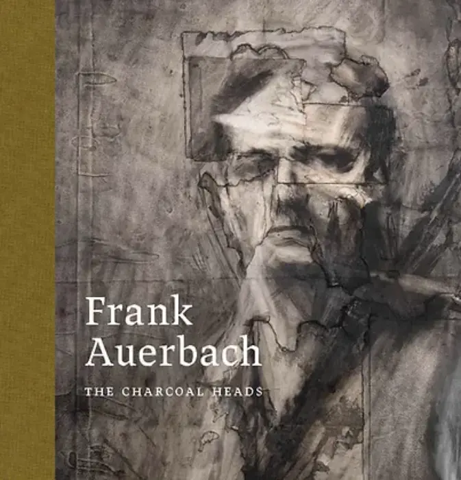
'Frank Auerbach: The Charcoal Heads' (The Courtauld until May 27 2024): Creative Destruction


They haunt the room like ghosts, not so much portraits as memories of personal and collective trauma. Frank Auerbach: The Charcoal Heads at the Courtauld is in many ways a limited exhibition: two rooms, twenty three works, mostly monochrome; a handful of sitters and a few short years out of a long, ongoing career. Yet there is nothing limiting about it. Auerbach is best known for solidity and forcefulness: his landscapes - the Courtauld has its own example on permanent display in an adjacent room - are literal reliefs, paint worms writhing out of the ground, deep furrows ploughed and excavated. The term 'impasto' seems drastically inadequate. There are some oil portraits in the Courtauld show which display the same aggressive manipulation of his medium, where features crumple under the weight of paint, into an almost Dorian Gray-like state of decay. But their sheer physicality is no match for the ethereal subtlety of the charcoal works which have both the otherworldly oddness of photographic negatives and the time-ravaged sense of something ancient.

Auerbach is no ordinary portraitist. His subjects are familiar, familial, himself, seen here in repeat. He observed them over months, each sitting recorded and erased in a process of layering and repeat. The time and process are writ large in scuffs and tears and mends: whilst Auerbach's oils seem often a process of building up, here he is constantly breaking down. It is one of the many contradictions. Works which have been produced so slowly are utterly immediate, a flash of dynamic lines. Faces in close-up scale largely avoid our gaze, with hollows for eyes which tilt down or turn aside. Line and structure are etched with a rubber. Never has creation seemed so destructive.

There is no context given to these figures - no background, no space, little detail - but once you know the context, rawness hangs acrid in the air. Auerbach's own tragedy, refugee child of parents murdered in Auschwitz, and the long, lingering shadow of the Second World War: physical and mental scars, visible wounds, patches of poverty and endless, endless grey. The occasional slash of colour seems like an attack rather than a respite. The faces take on a ghoulish emptiness, stripped back, almost genderless. Yet the final, greatest paradox of this show is that humanity triumphs in the end. Auerbach's self portraits are thoughtfully challenging in their strong, straight stare. His cousin, Gerda Boehm, another refugee, his substitute parent, retains her poise and gentility. Helen Gillespie is all angles and sharp edges, positively glinting with wit. These characters breath and move, with subtle shifts of pose, lighting and expression across the different charcoals. Not ghosts after all.

Wednesday, April 3, 2024

'Entangled Pasts: 1768–now Art, Colonialism and Change' (Royal Academy until 28 April 2024): Difficult to Disentangle

John Singleton Copley, Watson and the Shark, 1778, National Gallery of Art, Washington

'Entangled' is one way to describe the Royal Academy's big spring show. Messy might be another. On one hand it's a wholly admirable and often successful attempt to come to terms with the institution's (and, by association, Britain's past). You couldn't describe this as tokenist.  It sprawls over twelve galleries and outside into the bleak wind-tunnel of a courtyard, an unsympathetic location for Tavares Strachan’s First Supper, where an ambiguous dialogue is set up with Joshua Reynolds atop his plinth behind. There are big loans - who doesn't want to see Watson and the Shark in all its absurd Jaws-esque glory - and some wonderful curatorial choices. The sight-lines created through the forlorn driftwood of El Anatsui's Akui's Surviving Children to both Frank Bowling's Middle Passage and Ellen Gallagher's Stabilising Spheres are aesthetically stunning and emotionally devastating. And, mercifully, there are none of the preachy wall texts which places like the Tate are so prone to. 

In their absence, however, is blandness and vagueness. Too often I was left wondering why? Why was John Singleton Copley there? Because he, like Benjamin West was American, although there was no attempt to analyse their unique position as colonial but white? Because of the Black figure ignored in a caption which focuses instead Watson's survival to become Mayor of London? Because Copley was a big eighteenth century name they could get hold of? Similarly, Bowling and Gallagher are part of a room dedicated to the sea which is split awkwardly between the Middle Passage and whaling with a couple of second-rate Turners for good measure. The 'Constructing Whiteness' display feels especially thrown together. Frank Dicksee's laughably awful Startled doesn't need a caption which ties itself in knots over 'aryanising', 'nordic' and 'classical'. The slippery language emphasises a nettle ungrasped: issues of Academy racism are taken up to the Second World War and then glossed over. Surely this was the moment to acknowledge the embarrassing truth that Sonia Boyce, the first Black female academician, was only elected in 2016.

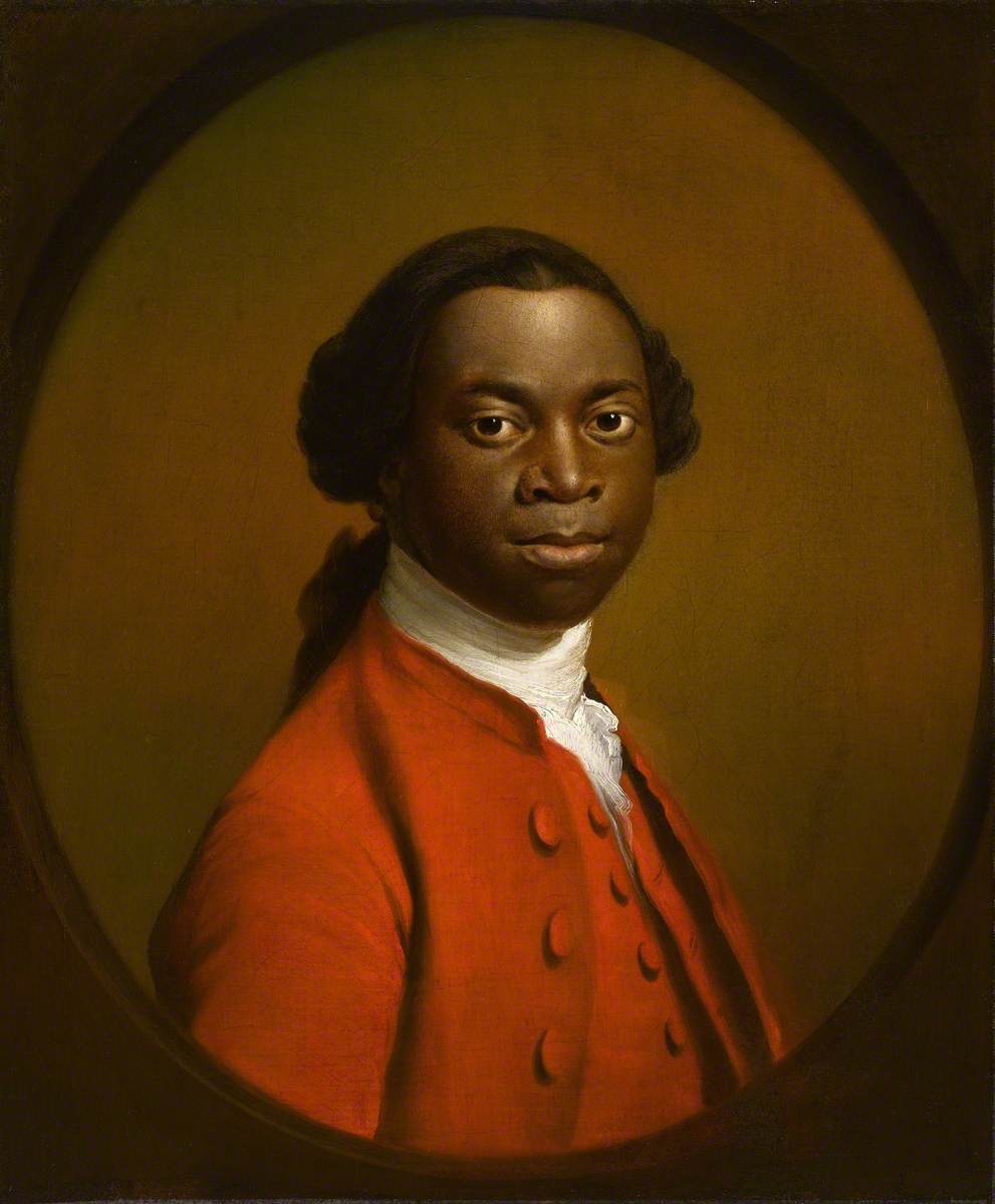
Unknown Artist, Portrait of a Man in a Red Suit, c.1740-80, Royal Albert Memorial Museum and Gallery, Exeter

'Entangled Pasts' raises obvious comparisons with the recent, albeit much smaller, 'Black Atlantic' exhibition at the Fitzwilliam Museum - even some of the same works are on show. The Fitzwilliam went for tightly written text and impeccable lighting to create nuance and structure and maximise their limited exhibits. The Royal Academy, in contrast, underuses Barbara Walker's Vanishing Point and the beautiful Man in a Red Suit is shown, along with fine portraits by Gainsborough, Reynolds and others in a gloomily empty octagon. Isaac Julien's film deserves a better space: crowded watchers jostle with those trying to get through to the sculptures beyond and the tintypes behind are impossible to see. Meanwhile, Lubaina Himid's Naming the Money installation sprawls over two rooms, its impact lessened as a result. Inevitably, with 100 works and 50 artists, there are weaker pieces and you could certainly make the case for some judicious pruning.

In some ways 'Entangled Pasts' is a show of (mainly) good art, poorly served. But maybe that doesn't matter. Its big, rambling, inconclusiveness is in itself a metaphor for the entangled past it's seeking to represent. There are no easy answers or straightforward narratives. There are questions and problems and dead-ends. The curators resolutely refuse to tell us what to think, but thank goodness for that.  What the show does - and arguably what it could have done even more - is pit the past against the present and let the results speak for themselves. Let's have more of the same.

Sunday, February 25, 2024

'Sargent and Fashion' (Tate Britain until Jul 7 2024): Fashion might be in Fashion, but Sargent is the Star

John Singer Sargent, Dr Pozzi at Home, 1881, Hammer Museum, Los Angeles 
(Wikimedia Commons)

Sargent and Fashion
is an awful title. I went to the exhibition with a feeling of dread: women sitters as clothes-horses and John Singer Sargent reduced, as he so often is, to celebrity portraitist. And yes, there are dresses and fans and feathers, but they enhance, not detract from, the paintings. The real reason to go, is to see a wonderful collection of Sargent's portraits, many of them from the United States, some of them never seen before in the UK. Fashion is something of a fashion at the moment: the Ashmolean recently linked art, objects and clothes in its Colour Revolution show and Birmingham Museum and Art Gallery is currently exhibiting dresses alongside its Pre-Raphaelites. Personally, I can take it or leave it: dresses are no different from other 'ephemera' which gets included in exhibitions as context. Like photographs or letters, or the rococo furnishings which Dulwich included in the exhibition last year to elucidate their claims about Berthe Morisot's 18th century influences, clothes can be helpful. But for me it remains all about the art.

Sargent is too often and too easily dismissed as a portraitist and whilst this exhibition sticks firmly to his representations of people, it is obvious, even from the first couple of rooms, that he isn't 'just' a painter of portraits. Equally, he is an artist who overlaps with Impressionism, both chronologically and personally - there is a lovely anecdote about his dismay in visiting Monet and finding no black paint in the house - yet is most emphatically not an Impressionist. In the context of innovation-obsessed art history, this makes him seem like a fuddy-duddy throwback, churning out Grand Manner portraits whilst the modern world moves on around him. Yet there is nothing staid about Sargent, or, one suspects, despite their corsets, about his sitters.

Sargent's female subjects are anything but clothes-horses. Many were personal friends, many he painted more than once, and the closeness shows. He is a master at finding the telling detail, the revealing tic. Madame X, so often seen as a cypher for unobtainable sexual allure because of that infamous drooping strap, in reality betrays a brittleness. You see it in that sharply profiled, retrousse nose and the thumb tensed on the polished wood table. Vernon Lee sparkles with vitality, like electricity crackling: the reflection on her glasses, the sheen on the end of her nose, the moist, mid-conversation lips and the random dashes of white above her eyebrows, under her chin. You are desperate to hear what she has to say. Mrs Edward L Davis strides out of the canvas with her mouth set and her hand on her hip, her skirts smothering her sailor-suited son whose hand she holds iron-fast. You fear for his future wife - she's never going to let him go.

The clothes are just as important. Not fashion, not decoration, but integral to the character  of their wearers. They give Mrs Edward Darley Boit her engaging energy - all polka-dots and swirls with a flame-like feather rising from her head. She's straight out of Henry James, the life and soul of every dinner party and, boy, does she go to a lot. They define the differences between sisters Betty and Ena Wertheimer: the quiet, pretty one, and the character who'll go on to play act for Sargent in borrowed robes. And of course, Sargent the artist uses clothes for his own purpose, pleasure and challenge. Black on black, white against white, dramatic colour contrasts, texture and pattern. Is fashion the right word for all this creativity with cloth?

If the curators get the title wrong, then they also over-egg their labelling with dressy details. I don't feel the need to have a written description, even if it is from a contemporary source, of an outfit which is literally next to it, either on canvas or in a vitrine. They have also succumbed to the fashion for eccentric wall colouring: here including a particularly nasty orange. A major gripe is the room which looks at Sargent's performativity and fluid representation of gender. Again, these are buzz themes which are easily overcooked and what the three 'masculinities' on display really show is the painter's ability to render character. Waif-like in his attenuated pallour, Graham Robertson is a 19th century Timothée Chalamet, so elegantly fragile he seems held vertical only by the tight rigidity of his coat. In Dr Pozzi at Home, the surgeon's fingers pluck delicately at the fabric of his floor-length red dressing gown, giving him an edgy femininity which the clothes alone do not. Between them, Henry Lee Higginson lounges in self-confident tweed, chin up, holding our gaze with a sense of impatience. Performance seems a superficial dismissal of these careful, subtle character studies.

John Singer Sargent, The Chess Game, c.1907, private collection (Wikimedia Commons)

What the curators get wonderfully right, however, is the expansive range of Sargent's work. They cover his idiosyncratic portraits of children, and of Robert Louis Stevenson and his wife; his theatricality including the masterly Ellen Terry as Lady Macbeth; his dabbles in aestheticism, not just Carnation, Lily, Lily, Rose but the ethereal Cashmere, paint as soft as the fabric itself. The small, late landscapes where strangely posed figures are swallowed up by verdant vegetation have a unique, abstracted mood. Fashion and character are not the issue here, you sense the impatience of an artist who just wants to experiment with paint, with form. Fabrics become watery pools, dappled with sunlight, clefted with shadow. Features blur into nothingness.

Sargent and Fashion might be an awful title, but it's clever marketing, and the exhibition is bound to be a success, attracting art lovers, clothes lovers and those for whom rooms full of elegance (male and female) have its own appeal. If the curatorial argument seems weak, then the paintings simply speak for themselves. Ultimately, Sargent is about so much more than fashion.
Saturday, January 27, 2024

'Dame Laura Knight - I Paint Today' (Worcester City art Gallery and Museum until June 30 2024): Just Scratching the Surface

Laura Knight Sundown, 1940-47, Wolverhampton Art Gallery, © the estate of Dame Laura Knight, DBE, RA / Bridgeman Images. Photo credit: Wolverhampton Arts and Heritage

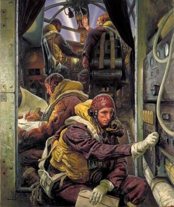
It is impossible to do justice to a career as long and prolific as Laura Knight's in two very small rooms, and you can leave Worcester Art Gallery's  I Paint Today feeling disappointed by the absences. There is very little of her early work: the soft shadows of a Staithes interior leaves you desperate for more, and two sun-baked clay pits noisy with labour are the only hint of her breezy, endless-summer Cornish coastal scenes. There is just one of her incredible series of works for the War Advisory Committee - but, boy, is it good. And a whole wall is given over to her husband's paintings, including two large, similar society portraits, in what seems a frustratingly unnecessary act of gender balance. 

What you do leave with, however, is a sense of Laura Knight's range and variety. Partly this is a product of a long life, lived determinedly in the present (here the title of the show seems particularly apposite). Knight started as a late nineteenth century naturalist, befriended by George Clausen, influenced by Dutch and French art; she became increasingly Impressionistic, embracing a richer almost Bloomsbury-esque palette during the 1930s, before employing her portraitist's eye for the observed realism of her wartime paintings. But her output is not just an accident of longevity. Knight was constantly exploring and experimenting, from acquiring Clausen's printing equipment for her own etchings, to jewellery, ceramics, and London Transport posters. In a small space, the Worcester curators give a sense of all this and more.

In some ways it's a messy exhibition. The chronology dots about, the thematic approach seems governed by availability of works as much as by any coherent plan. There are, for me, too many of Knight's circus and Gypsy subjects, presented here without comment despite their potentially problematic representations. Whilst The Grand Parade, Charivari has an unintentional  surrealism, her backstage theatricals seem polite and dated. However, the curators' efforts are also clear: there are loans aplenty, good, sensibly written wall texts and even some afternoon talks. Could it have been a better exhibition if it focussed on one aspect of her work - perhaps. The local interest connection of the Malverns, the subject of a 2020 book by Heather Whatley, could easily have become the theme of the show. 

Laura Knight suffered under the modernist hegemony of the late twentieth century: she was too naturalistic, too figurative, and far too establishment. Thankfully, she is now gaining the attention she deserves and if the exhibition at Worcester introduces more people to her variety and her talent it will be a good thing. I Paint Today might not be the best exhibition you'll go to, it certainly isn't the best exhibition of Knight's work that I've seen. But it contains at least one masterpiece: Take-Off, Interior of a Bomber is big and bold and utterly compelling in its juxtaposition of calm observation and impending tragedy. A display of Knight's wartime paintings  - now that would be a grand thing indeed. 

Sunday, January 21, 2024

'Pesellino: A Renaissance Master Revealed' (National Gallery until March 10 2024): Delight in Detail

Pesellino, King Melchior Sailing to the Holy Land , c.1440-45, 
Clark Art Institute, Williamstown, Massachusetts, (Wikimedia Commons)

A single, dark room in the National Gallery shimmers with colour and pattern and detail. It feels intimate and otherworldly after the cavernous spaces and damask walls of the main displays; even busy with people there's a hushed, chapel-like atmosphere. Pesellino is not a 'big name' but you walk out thinking he ought to be. There is something so joyously exuberant about his art, so crazily outlandish. Why add pink marshmallow clouds to his King Melchior Sailing to the Holy Land ? Why surround his Pistoia Crucifixion with surreally-weird disembodied putti? Why have a bear cub snuffling in the foreground of David's grand victory parade? Just for the hell of it, for the brash Icarus-like, 'look at me fly' nerve of it. Even without knowing the tragedy of his early death from the plague, you have to love the guy.

Pesellino was at the centre of artistic life in Florence, at a time when Florence was pretty much at the centre of artistic life; he worked with big names like Filippo Lippi, he worked for big names like the Medici, who commissioned the David panels here. He was also a canny operator: illuminated manuscripts, devotional diptychs, furniture. You get the idea that if the price was right, and the patron was right, then Pesellino, like most of the artists of the day, would turn his hand anything.  He lived right in the middle of that exciting, anything-is-possible time in the midst of the fifteenth century when new - Masaccio's perspectival experiments - and the old - pattern and gold and natural detail  - coexisted in a gloriously chivalrous battle. You can see Uccello's San Romano in Pesellino's foreshortened knights and stylised horses; you can see Botticelli's elegant angels their draperies blowing in the breeze; you can see Gentile da Fabriano's gilded luxury. But if that all makes, Pesellino sound like an artistic magpie, nicking the others' best ideas, you'd be wrong. There is also something uniquely, idiosyncratically him.

Pesellino, David and Goliath, c.1445, National Gallery, London, (Wikimedia Commons)

The little exhibition also showcases the National Gallery. They do this kind of thing so impeccably well that you forget the time and effort (and money obviously) which goes into even a one-room exhibition like this. We owe them for originally gathering together the hacked up pieces of the Pistoia altarpiece, now united. We owe their conservation team their labour in restoring the battered furniture panels of the cassone, with their visible key marks. We owe the curators for having the foresight to see that this was a show worth having and reaching out to get loans like the King Melchior. And most of all, we owe them for not charging an entrance fee. It would be very easy for the gallery to rest on its laurels, put on the big shows and watch the visitors come through the doors, but, as anyone who visits regularly knows, they are constantly tweaking, moving, changing; and always producing these mini-displays. You can also see Jean-Étienne Liotard's pastels at the moment. 

So, go! Make use of the magnifying glasses provided, the excellent key which clarifies the complex multiple scene-narrative of the David panels, and the conservation video which shows just how mind-blowingly skillful Pesellino was in his pre-application of tiny gold leaf details. But most of all just go and enjoy some of the best art you'll see this year. By a guy who never even makes it into the history books. 

Thursday, January 18, 2024

'Holbein at the Tudor Court' (Queen's Picture Gallery until April 14 2024): Picture Perfect

Hans Holbein the Younger, Johannes Froben, c.1522-3, Royal Collection, (Wikimedia Commons)

Holbein at the Tudor Court is a schizophrenic exhibition: it can't decide whether it is a show about court propaganda or an indepth look at Hans Holbein's art. On the one hand there are three grand set pieces depicting The Battle of the Spurs, the Field of the Cloth of Gold and the Family of Henry VIII. All are magnificent, giving a sense of Tudor self-importance and the lengths which the new dynasty would go to establish its image; they primarily of historical rather than artistic significance but worth seeing for all that. The Field of the Cloth of Gold has been recently conserved, the various anonymous hands clearly distinguishable, its details vividly clear, displaying a combination of humour, opulence which includes an almost fanciful dragon firework in the sky  The exhibition has a free audio guide, which looks at a small number of works, including this, in depth, and it is very good. But these three stand out. Less convincing are the Flemish School Holbein rip-offs, like the portrait of Princess Elizabeth: arguably they emphasise the gulf in ability between their producers, but in reality their presence seems only to dilute and diminish that of the original. Then stuck in the middle of the last gallery we have suits of armour, arguably there only to fill the space. Queen's Picture Gallery exhibitions are all about showcasing the royal collection, but sometimes they need a bit of judicious pruning.

However, it is really, and it certainly should really be, the Holbein show, and this is where it takes off. The Royal Collection has an embarrassment of riches when it comes to his work, both drawings and paintings, and they make good use of their treasures. After a brief introduction which shows the artist's early religious subjects, we dive straight in. Drawing after drawing shows his method and his skill: precise features, sketched dress, written notes on colour and detail, economical and efficient. He worked on pink-tinted paper to better represent the complexion of his sitters. We see the punch marks which he used to transfer drawing to painting. We learn the tricks of the trade which allowed him to elongate faces or increase stature. Occasionally - though not often enough  - we are presented with drawing and painting side by side, the whole process in all its perfect completeness.

Hans Holbein the Younger, William Warham, Archbishop of Canterbury
1527, Royal Collection (Wikimedia Commons)

That is the overriding impression of this exhibition. Perfection. Holbein has the precision, the finesse and the seemingly effortless alchemy to turn paint into fur, silk, hair, skin. There is something almost unnatural about the non-photographic, photographic accuracy, AI in paint. His colours, especially those teal greens and blues have a richness which brings the sixteenth century into living touchable vitality. His observation is so acute that physical characteristics merge into psychological traits. Here is Thomas More, stubble pin-pricking his chin, a slight sag under the eyes that it is almost impossible not to read prophetically; Archbishop Warham wearied by age and weight of being a man of God in an age of politics. His men are better than his women who seem constrained by the requirements of fashion and ideals of beauty, but even then, with his drawing of Mary Shelton, the set of her lips, the intensity of her gaze creates a compelling sense of pent-up conformity.

This is a quiet exhibition. There is grandeur. There are show-stoppers. Holbein's painting is rich and virtuosic and quite simply beautiful. But it's the still, small voice of those calm, pale drawings which stays with you. In many ways they were nothing: a sales-pitch, a polaroid snap, a means to an end. But they bring the past into the present more effectively than any history book. And they display the essence of portraiture more succinctly than the grandest oil. They're everything.

Thursday, January 11, 2024

'Impressionists on Paper: Degas to Toulouse-Lautrec' (Royal Academy until 10 March 2024): Not a Great Impressionism

Henri de Toulouse Lautrec, Woman with a Black Boa, 1892, 
Essence (diluted oil paint) on cardboard Musée d’Orsay, Paris

It must have seemed like such a good idea: those perennial crowd-pleasers, the Impressionists, but on paper. Yet the current exhibition at the RA proves that what looks good on paper doesn't necessarily work in practice. The show consists of three rooms of works which are not all on paper and not all by Impressionists. And if that sounds a mess then it's exacerbated by minimal captioning - most works are given just tombstone labels - and sweepingly generalised wall texts.


There is a bewildering lack of curation which leaves no sense of why works were hung in the order they were. Beyond the broadest chronology - the second room text discusses the 'New Directions' of Post Impressionism but starts with Monet - the main criteria seems to be to leave the biggest / most colourful till last. There is a lot of standard stuff about ‘capturing the moment’ and new portable colours (both of which apply equally to paint on canvas) and a drily precise handout which provides a glossary of terms. Anyone who knows anything about Impressionism would pick holes in the former, the general visitor may well give up with the latter. The RA, which alone among the main London museums does not give proper concession rates, boasts that the admission price includes £2.50 for the exhibition guide. I would much prefer to have been given a choice.


Of course, any Impressionist show has plenty of works which make you forget your grumbling. In the first room, Degas’ small oil and graphite Lyda, Woman with a Pair of Binoculars coolly stares you out. Later his choice of neon green paper gives startling modernity to a few rough lines. Monet’s pastels of Etretat have a smudged nightmarishness, like the evil twin of his lively, richly coloured oils. Seurat beguiles with his soft monochromes, in dialogue the workmanlike angularity of Van Gogh across the room as they both took on the legacy of mid-century realist Jean Francois Millet. There are also discoveries: Federico Zandomeneghi's soft richness lingers in the memory, and even Hippolyte Petitjean's fairly generic pointillism stands out, a burst of sunlight against the overall drabness. Too often the big names disappoint: Pissarro's Apple Picking has none of the lush late-summeriness of his oil versions of the same subject and Lautrec, despite having his name in the title, is poorly served. It is only in Woman with Black Boa that you get a true glimpse of his wit, observation and quick line.


It is never a good sign when the best works in an exhibition are already familiar, like the Degas' Woman Drying Herself, or Redon's Ophelia Among the Flowers, both of which have just taken a taxi across London from the National Gallery. In fact, Redon is a highlight overall, despite being tenuously connected with Impressionism. The eerie blackness and shimmering colour of Stained Glass Window and the glistening silence of The Golden Cell both exploit and elevate their materials far more effectively than most of the other works on show.


Odilon Redon, The Golden Cell’(Profile of a Woman’s Head), 1892,
Oil and coloured chalks with gold on paper, British Museum, London


The curators make bold claims that the Impressionists broke traditional hierarchies and reinvented paper as an exhibition-able medium, but they offer little in the way of context. The large scale and soft finish of Jacques-Emile Blanche's Portrait of Madame Henri Wallet surely needs to be referenced alongside an eighteenth-century tradition of pastel portraiture. Equally, they weaken their argument by making no distinction between works which are clearly intended as quick sketches, like Manet's The Rue Mosnier in the Rain, and 'finished' (for want of a better word) examples. Pissarro has put time, effort and a range of materials into his Market Stall and the result is considered and complex. Artists have always worked on paper, and these have always been varied in intention. Ingres' perfect pencil portraits, Constable's cloud studies, let alone the whole watercolour tradition: these surely merit acknowledgement.


Any exhibition about the Impressionists is worth seeing. There were works here that I loved and that have stayed with me, but it might have been a better show without any intervention from the curators, just pictures on walls. Why do we need to set these artists up as revolutionary, proto-Modernists? Let them create their own impression.


Zurbaran (National Gallery until August 23 2026): Perfection in a Piece of Cloth

Francisco de Zurbaran, The Martydom of St Serapion , 1628, Wadsworth Atheneum, Hartford Connecticut Francisco de Zurbaran is often describe...