Saturday, January 27, 2024

'Dame Laura Knight - I Paint Today' (Worcester City art Gallery and Museum until June 30 2024): Just Scratching the Surface

Laura Knight Sundown, 1940-47, Wolverhampton Art Gallery, © the estate of Dame Laura Knight, DBE, RA / Bridgeman Images. Photo credit: Wolverhampton Arts and Heritage

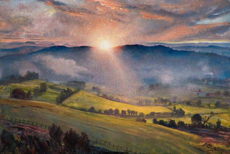
It is impossible to do justice to a career as long and prolific as Laura Knight's in two very small rooms, and you can leave Worcester Art Gallery's  I Paint Today feeling disappointed by the absences. There is very little of her early work: the soft shadows of a Staithes interior leaves you desperate for more, and two sun-baked clay pits noisy with labour are the only hint of her breezy, endless-summer Cornish coastal scenes. There is just one of her incredible series of works for the War Advisory Committee - but, boy, is it good. And a whole wall is given over to her husband's paintings, including two large, similar society portraits, in what seems a frustratingly unnecessary act of gender balance. 

What you do leave with, however, is a sense of Laura Knight's range and variety. Partly this is a product of a long life, lived determinedly in the present (here the title of the show seems particularly apposite). Knight started as a late nineteenth century naturalist, befriended by George Clausen, influenced by Dutch and French art; she became increasingly Impressionistic, embracing a richer almost Bloomsbury-esque palette during the 1930s, before employing her portraitist's eye for the observed realism of her wartime paintings. But her output is not just an accident of longevity. Knight was constantly exploring and experimenting, from acquiring Clausen's printing equipment for her own etchings, to jewellery, ceramics, and London Transport posters. In a small space, the Worcester curators give a sense of all this and more.

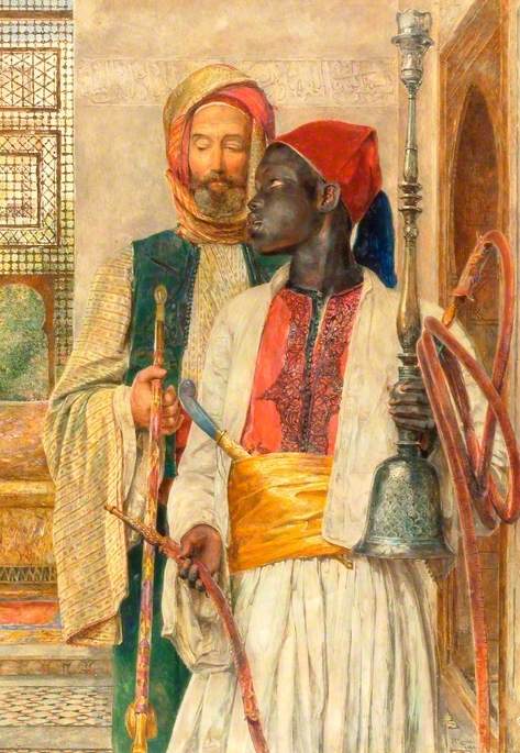
In some ways it's a messy exhibition. The chronology dots about, the thematic approach seems governed by availability of works as much as by any coherent plan. There are, for me, too many of Knight's circus and Gypsy subjects, presented here without comment despite their potentially problematic representations. Whilst The Grand Parade, Charivari has an unintentional  surrealism, her backstage theatricals seem polite and dated. However, the curators' efforts are also clear: there are loans aplenty, good, sensibly written wall texts and even some afternoon talks. Could it have been a better exhibition if it focussed on one aspect of her work - perhaps. The local interest connection of the Malverns, the subject of a 2020 book by Heather Whatley, could easily have become the theme of the show. 

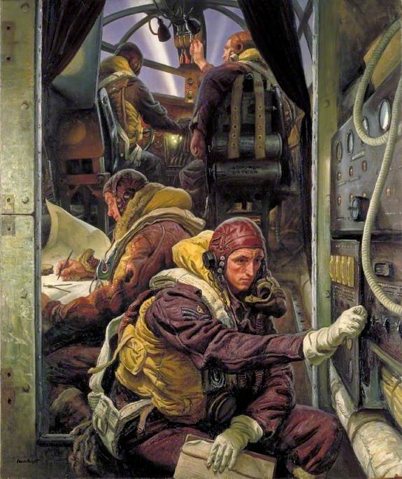
Laura Knight suffered under the modernist hegemony of the late twentieth century: she was too naturalistic, too figurative, and far too establishment. Thankfully, she is now gaining the attention she deserves and if the exhibition at Worcester introduces more people to her variety and her talent it will be a good thing. I Paint Today might not be the best exhibition you'll go to, it certainly isn't the best exhibition of Knight's work that I've seen. But it contains at least one masterpiece: Take-Off, Interior of a Bomber is big and bold and utterly compelling in its juxtaposition of calm observation and impending tragedy. A display of Knight's wartime paintings  - now that would be a grand thing indeed. 

Sunday, January 21, 2024

'Pesellino: A Renaissance Master Revealed' (National Gallery until March 10 2024): Delight in Detail

Pesellino, King Melchior Sailing to the Holy Land , c.1440-45, 
Clark Art Institute, Williamstown, Massachusetts, (Wikimedia Commons)

A single, dark room in the National Gallery shimmers with colour and pattern and detail. It feels intimate and otherworldly after the cavernous spaces and damask walls of the main displays; even busy with people there's a hushed, chapel-like atmosphere. Pesellino is not a 'big name' but you walk out thinking he ought to be. There is something so joyously exuberant about his art, so crazily outlandish. Why add pink marshmallow clouds to his King Melchior Sailing to the Holy Land ? Why surround his Pistoia Crucifixion with surreally-weird disembodied putti? Why have a bear cub snuffling in the foreground of David's grand victory parade? Just for the hell of it, for the brash Icarus-like, 'look at me fly' nerve of it. Even without knowing the tragedy of his early death from the plague, you have to love the guy.

Pesellino was at the centre of artistic life in Florence, at a time when Florence was pretty much at the centre of artistic life; he worked with big names like Filippo Lippi, he worked for big names like the Medici, who commissioned the David panels here. He was also a canny operator: illuminated manuscripts, devotional diptychs, furniture. You get the idea that if the price was right, and the patron was right, then Pesellino, like most of the artists of the day, would turn his hand anything.  He lived right in the middle of that exciting, anything-is-possible time in the midst of the fifteenth century when new - Masaccio's perspectival experiments - and the old - pattern and gold and natural detail  - coexisted in a gloriously chivalrous battle. You can see Uccello's San Romano in Pesellino's foreshortened knights and stylised horses; you can see Botticelli's elegant angels their draperies blowing in the breeze; you can see Gentile da Fabriano's gilded luxury. But if that all makes, Pesellino sound like an artistic magpie, nicking the others' best ideas, you'd be wrong. There is also something uniquely, idiosyncratically him.

Pesellino, David and Goliath, c.1445, National Gallery, London, (Wikimedia Commons)

The little exhibition also showcases the National Gallery. They do this kind of thing so impeccably well that you forget the time and effort (and money obviously) which goes into even a one-room exhibition like this. We owe them for originally gathering together the hacked up pieces of the Pistoia altarpiece, now united. We owe their conservation team their labour in restoring the battered furniture panels of the cassone, with their visible key marks. We owe the curators for having the foresight to see that this was a show worth having and reaching out to get loans like the King Melchior. And most of all, we owe them for not charging an entrance fee. It would be very easy for the gallery to rest on its laurels, put on the big shows and watch the visitors come through the doors, but, as anyone who visits regularly knows, they are constantly tweaking, moving, changing; and always producing these mini-displays. You can also see Jean-Étienne Liotard's pastels at the moment. 

So, go! Make use of the magnifying glasses provided, the excellent key which clarifies the complex multiple scene-narrative of the David panels, and the conservation video which shows just how mind-blowingly skillful Pesellino was in his pre-application of tiny gold leaf details. But most of all just go and enjoy some of the best art you'll see this year. By a guy who never even makes it into the history books. 

Thursday, January 18, 2024

'Holbein at the Tudor Court' (Queen's Picture Gallery until April 14 2024): Picture Perfect

Hans Holbein the Younger, Johannes Froben, c.1522-3, Royal Collection, (Wikimedia Commons)

Holbein at the Tudor Court is a schizophrenic exhibition: it can't decide whether it is a show about court propaganda or an indepth look at Hans Holbein's art. On the one hand there are three grand set pieces depicting The Battle of the Spurs, the Field of the Cloth of Gold and the Family of Henry VIII. All are magnificent, giving a sense of Tudor self-importance and the lengths which the new dynasty would go to establish its image; they primarily of historical rather than artistic significance but worth seeing for all that. The Field of the Cloth of Gold has been recently conserved, the various anonymous hands clearly distinguishable, its details vividly clear, displaying a combination of humour, opulence which includes an almost fanciful dragon firework in the sky  The exhibition has a free audio guide, which looks at a small number of works, including this, in depth, and it is very good. But these three stand out. Less convincing are the Flemish School Holbein rip-offs, like the portrait of Princess Elizabeth: arguably they emphasise the gulf in ability between their producers, but in reality their presence seems only to dilute and diminish that of the original. Then stuck in the middle of the last gallery we have suits of armour, arguably there only to fill the space. Queen's Picture Gallery exhibitions are all about showcasing the royal collection, but sometimes they need a bit of judicious pruning.

However, it is really, and it certainly should really be, the Holbein show, and this is where it takes off. The Royal Collection has an embarrassment of riches when it comes to his work, both drawings and paintings, and they make good use of their treasures. After a brief introduction which shows the artist's early religious subjects, we dive straight in. Drawing after drawing shows his method and his skill: precise features, sketched dress, written notes on colour and detail, economical and efficient. He worked on pink-tinted paper to better represent the complexion of his sitters. We see the punch marks which he used to transfer drawing to painting. We learn the tricks of the trade which allowed him to elongate faces or increase stature. Occasionally - though not often enough  - we are presented with drawing and painting side by side, the whole process in all its perfect completeness.

Hans Holbein the Younger, William Warham, Archbishop of Canterbury
1527, Royal Collection (Wikimedia Commons)

That is the overriding impression of this exhibition. Perfection. Holbein has the precision, the finesse and the seemingly effortless alchemy to turn paint into fur, silk, hair, skin. There is something almost unnatural about the non-photographic, photographic accuracy, AI in paint. His colours, especially those teal greens and blues have a richness which brings the sixteenth century into living touchable vitality. His observation is so acute that physical characteristics merge into psychological traits. Here is Thomas More, stubble pin-pricking his chin, a slight sag under the eyes that it is almost impossible not to read prophetically; Archbishop Warham wearied by age and weight of being a man of God in an age of politics. His men are better than his women who seem constrained by the requirements of fashion and ideals of beauty, but even then, with his drawing of Mary Shelton, the set of her lips, the intensity of her gaze creates a compelling sense of pent-up conformity.

This is a quiet exhibition. There is grandeur. There are show-stoppers. Holbein's painting is rich and virtuosic and quite simply beautiful. But it's the still, small voice of those calm, pale drawings which stays with you. In many ways they were nothing: a sales-pitch, a polaroid snap, a means to an end. But they bring the past into the present more effectively than any history book. And they display the essence of portraiture more succinctly than the grandest oil. They're everything.

Thursday, January 11, 2024

'Impressionists on Paper: Degas to Toulouse-Lautrec' (Royal Academy until 10 March 2024): Not a Great Impressionism

Henri de Toulouse Lautrec, Woman with a Black Boa, 1892, 
Essence (diluted oil paint) on cardboard Musée d’Orsay, Paris

It must have seemed like such a good idea: those perennial crowd-pleasers, the Impressionists, but on paper. Yet the current exhibition at the RA proves that what looks good on paper doesn't necessarily work in practice. The show consists of three rooms of works which are not all on paper and not all by Impressionists. And if that sounds a mess then it's exacerbated by minimal captioning - most works are given just tombstone labels - and sweepingly generalised wall texts.


There is a bewildering lack of curation which leaves no sense of why works were hung in the order they were. Beyond the broadest chronology - the second room text discusses the 'New Directions' of Post Impressionism but starts with Monet - the main criteria seems to be to leave the biggest / most colourful till last. There is a lot of standard stuff about ‘capturing the moment’ and new portable colours (both of which apply equally to paint on canvas) and a drily precise handout which provides a glossary of terms. Anyone who knows anything about Impressionism would pick holes in the former, the general visitor may well give up with the latter. The RA, which alone among the main London museums does not give proper concession rates, boasts that the admission price includes £2.50 for the exhibition guide. I would much prefer to have been given a choice.


Of course, any Impressionist show has plenty of works which make you forget your grumbling. In the first room, Degas’ small oil and graphite Lyda, Woman with a Pair of Binoculars coolly stares you out. Later his choice of neon green paper gives startling modernity to a few rough lines. Monet’s pastels of Etretat have a smudged nightmarishness, like the evil twin of his lively, richly coloured oils. Seurat beguiles with his soft monochromes, in dialogue the workmanlike angularity of Van Gogh across the room as they both took on the legacy of mid-century realist Jean Francois Millet. There are also discoveries: Federico Zandomeneghi's soft richness lingers in the memory, and even Hippolyte Petitjean's fairly generic pointillism stands out, a burst of sunlight against the overall drabness. Too often the big names disappoint: Pissarro's Apple Picking has none of the lush late-summeriness of his oil versions of the same subject and Lautrec, despite having his name in the title, is poorly served. It is only in Woman with Black Boa that you get a true glimpse of his wit, observation and quick line.


It is never a good sign when the best works in an exhibition are already familiar, like the Degas' Woman Drying Herself, or Redon's Ophelia Among the Flowers, both of which have just taken a taxi across London from the National Gallery. In fact, Redon is a highlight overall, despite being tenuously connected with Impressionism. The eerie blackness and shimmering colour of Stained Glass Window and the glistening silence of The Golden Cell both exploit and elevate their materials far more effectively than most of the other works on show.


Odilon Redon, The Golden Cell’(Profile of a Woman’s Head), 1892,
Oil and coloured chalks with gold on paper, British Museum, London


The curators make bold claims that the Impressionists broke traditional hierarchies and reinvented paper as an exhibition-able medium, but they offer little in the way of context. The large scale and soft finish of Jacques-Emile Blanche's Portrait of Madame Henri Wallet surely needs to be referenced alongside an eighteenth-century tradition of pastel portraiture. Equally, they weaken their argument by making no distinction between works which are clearly intended as quick sketches, like Manet's The Rue Mosnier in the Rain, and 'finished' (for want of a better word) examples. Pissarro has put time, effort and a range of materials into his Market Stall and the result is considered and complex. Artists have always worked on paper, and these have always been varied in intention. Ingres' perfect pencil portraits, Constable's cloud studies, let alone the whole watercolour tradition: these surely merit acknowledgement.


Any exhibition about the Impressionists is worth seeing. There were works here that I loved and that have stayed with me, but it might have been a better show without any intervention from the curators, just pictures on walls. Why do we need to set these artists up as revolutionary, proto-Modernists? Let them create their own impression.


Friday, October 27, 2023

Colour Revolution: Victorian Art, Fashion and Design (Ashmolean Museum, Oxford until Feb 18 2024): Not Revolutionary but Certainly Colourful

John Frederick Lewis, The Pipe Bearer, 1858, Birmingham Museums

William Morris would have loved the Ashmolean's 'Colour Revolution'. It is crammed full of  beautiful, often useful things and it provides an equally beautiful, useful survey of Victorian culture, taste and innovation, their priorities and their prejudices. It is larger than I expected, more interesting, full of detail and well presented, albeit sometimes frustratingly dingy, for obvious conservation reasons. Ultimately, however, it is unsatisfying: stories left unfinished, avenues unpursued, threads dangling.

The main problem is that the exhibition starts with a flawed premise: we have a mourning dress, a black and white photograph, a Dickens quote, all setting up the narrative that the past is a dreary place. Yet anyone who knows anything about nineteenth century art and design, knows that it's all about colour, pattern and excess. The interesting story here is not the manufactured narrative of a 'colour revolution', but rather the real revolutions in manufacture, technology and trade which allowed the Victorians' love of colour to permeate through society and across the world. The exhibition does a good job of looking at potentially dry topics like the discovery of aniline dyes, advances in electroplating; and the costs involved, to individuals hanging arsenic-green wallpaper, or lead-painting majolica, to the wider world (natural dye producers in India), and to nature - thousands of hummingbirds sacrificed to fashion each year. This is where the exhibition is strongest and most innovative.

Interesting too is the focus on the 1862 great(ish) International Exhibition which rarely gets any mention. William Burges' Great Bookcase is an arts and crafts masterpiece. A Daughter of Eve, her skin colour achieved with electrotype bronze, stops you in your tracks. The curators do well, in this age of didactic labelling, to let the image speak for itself: abolitionist pride in the midst of the American Civil War off-set by the statue's relegation to a trade stand. Not art but commerce. The fashion - not usually my thing - is also well-chosen and well-presented. Gaudily-striped stockings (for men and women) and a purple aniline dress which seems to have walked out of a Pre-Raphaelite painting; iridescently-gleaming necklaces which on closer inspection are made from hummingbird heads and beetles. Finally, the show dips into the Victorians' inspirations: from history, from the Middle and Far East, and from nature itself. Again, there is luscious Kashmir paisley, jewel-like Medieval manuscripts, ubiquitous Japanese prints, but the displays only scratch the surface.

JMW Turner, Venice, from the Porch of Madonna della Salute, c.1835, 

Metropolitan Museum of Art, New York

The paintings are colourful. but hardly revolutionary. Many of the works are overfamiliar loans from the Tate - beautifully lit here and still a pleasure to see, as old friends always are, but Mariana and April Love are too-obvious curatorial choices. The Turner view of Venice on loan from the Met is on another level. Not one of his too-vague sunlight and air canvases but a luminous explosion of colour, rich reds and blues bleeding out from the boat in the centre of the painting like dye in water. Albert Moore is also nicely showcased, with a run of three near-identical paintings, differing only in their colour choices; and placed alongside Whistler his dreamily-soft palette takes on a new, more radical edge. Both artists are a welcome boost to the last room which seems a little low-key. Perhaps the 'Yellow Nineties' simply cannot compete with the intense colour and pattern already shown, perhaps it is just too difficult to buy into the immorality. Although Grasset's 1897 poster showing a morphine addict injecting her thigh is genuinely shocking.

There is a lot that the Ashmolean doesn't focus on. William Morris is poorly covered. Art Nouveau surely deserves a mention. The importance of colour to the Spiritualist movement is ignored, despite a focus on High Anglican design. But it is always churlish to dwell on what isn't in an exhibition. Ultimately this is show of intensely beautiful detail which also manages to convey big ideas, like Darwin's theory of sexual selection, with almost throwaway ease. You leave with a vivid sense of 'Victorian art, fashion and design', and a desire to find out more.

I want to go back. You can't really have a better recommendation. 


Sunday, October 1, 2023

The Picasso Problem

2023 is the fiftieth anniversary of the death of Pablo Picasso, one of the giants of twentieth century Modernism. Hailed as a genius, he transcended the art world, achieving the kind of universal status and recognisability normally reserved for film stars. Only Warhol, Pollock and possibly Dali have reached that level of ubiquity. Perhaps inevitably, since his death, there has been a reckoning, accelerated by the #metoo movement. Picasso is now more likely to be cast as a misogynistic abuser and exploiter of women, the personification of all that is negative about the 'male genius' myth. The backlash is so significant that there are no major exhibitions to commemorate this year's anniversary - although plenty of lesser ones. The Picasso Museum in Paris has controversially rehung the artist's work, with the aim of appealing to a younger generation, employing British designer Paul Smith to add 'colour and kitsch' and including interventions by contemporary artists. Meanwhile, the Brooklyn Museum commissioned Australian comedian, Hannah Gadsby to curate 'It's Pablo-matic', examining 'the artist’s complicated legacy through a critical, contemporary, and feminist lens'. 

Picasso needed to be reassessed and his personal life, particularly his relationships with a series of women, is deeply problematic. But in all this, the one thing that that is in danger of being ignored is the art. For much of his life, Picasso may indeed have lived off his reputation and his celebrity, but for a few crucial years at the start of the twentieth century he really did, undeniably, revolutionise art. In a post-Modernist, post-representational, post-painterly world, the significance of Cubism can be underplayed, but look at one of Picasso's paintings of, say, 1910, in the context of what else was being produced and the impact is immediate. The National Gallery's 2023 After Impressionism exhibition meandered through tinkering experimentations with colour and composition until it brought you face to face with Portrait of Wilhelm Uhde, a silent explosion, like a Cornelia Parker on canvas. The fragmented facets, multiple viewpoints in time and space, create a characterful representation which is nevertheless divorced from the reality of both traditional Western art and photographic imitation. The ghost of Cezanne lingers in the subtly applied brushwork and soft tonal shifts but Picasso has effectively relegated the past to the past. 

Analytical Cubism, as it is drily known, was not just an esoteric, intellectual exercise. Its impact spread rapidly and widely. Futurist work in Italy, Russia and the UK could not have existed without Picasso and Braque, and through the Futurists came dynamic abstraction. Mondrian, having dabbled with colour based simplification, turned to Cubism for his Pier and Ocean series, again a step on the road to geometric abstraction. The Delaunays saw the potential of fragmenting through light and colour. Others, like Leger, created a more solidly sculptural version of Cubist facets. And if that wasn't enough to guarantee Picasso's significance, his found-object reliefs play a similarly seminal role in twentieth century sculpture, paving the way for constructivism, ready-mades and the use of new materials. 

You could end your story of Picasso in 1914 and he would still have done enough to earn a place in the history of twentieth century art, but the story does not stop there. Like virtually all of his contemporaries, Picasso's radical vision shifted after the First World War, turning back to representation and embracing a chunky classicism. However, by the end of the 1920s he was synthesising the clear colours and draughtsmanship of the start of the decade with the angularity and spatial distortions of his earlier work. The Spanish Civil War added a political, personal dimension, culminating in Guernica, a cri de coeur on a monumental scale which tears savagely at the rules of art.

The elephant in the room here is Les Demoiselles d'Avignon, Picasso's huge 1907 depiction of five nude sex workers, two of whom are wearing African-style masks. It is a deeply disturbing painting. It's meant to be. Similar shock-tactics by Manet in Le Dejeuner sur l'Herbe have been softened by time and familiarity, so that the panting now looks slightly quaint, but Demoiselles still cuts deep. Ugliness is hard to take. The casual appropriation of Iberian, Egyptian and African artistic heritage is problematic in a post-colonial world. The cold manipulation of the five female figures can be read as misogynistic. Yet, Demoiselles is in many ways the logical end-point of Post-Impressionism, which had seen artists question traditional ideas of beauty, perspective and finish; and consciously look beyond the Western academic tradition. Picasso was doing what other artists have done. He was just pushing a bit further. 

Whilst all these profoundly significant works were being produced, Picasso was living a life as a serial exploiter, sometimes abuser, of a number of women. He was, by all accounts, not a nice man. His artistic success probably exacerbated the problem: from around 1910 he was feted, increasingly wealthy, and able to have and do whatever he wanted. For the second half of his life, certainly after the Second World War, he pretty much lived off his past reputation, nurtured by an art market which paid ever extortionate amounts for anything and everything which he produced. But none of that changes the fact that he made some extraordinary, seismic art. The problem with Picasso is Picasso, not the paintings.

Thursday, August 31, 2023

'Berthe Morisot: Shaping Impressionism' (Dulwich Picture Gallery until Sept 10 2023)

Berthe Morisot, In the Bois de Boulogne, 1879, National Museum, Stockholm

The fact that Berthe Morisot, one of the major figures of French Impressionism, hasn't had a one-woman show in the UK in living memory, is an appalling indictment of our attitudes to women artists. The fact that her long overdue exhibition is not at the National Gallery or the Tate but at Dulwich Picture Gallery is similarly embarrassing. So well done, Dulwich! But, and there is a but, instead of being treated to a straightforward retrospective of her work - as the title suggests - we have a left-field approach which links Morisot to eighteenth century art. This is not just a case of mis-selling: 'Shaping Impressionism' implies her pivotal role within the movement but that gets lost in the actual gallery display. Equally, it is difficult to see Morisot as a radical mover and shaker when we are constantly being referred back to the previous century. Disappointingly, too, the Rococo drift means that the exhibition is thin on what are arguably her best works, those featuring figures in landscape. And perhaps more unforgivably, the woman should be centre-stage is forced to share wall space with a series of men. 

The Rococo argument is a valid and well-established one: there was a genuine revival in interest following the expansion of the Louvre's eighteenth century collections from the 1840s, and only last year Frankfurt's Staedel Museum hosted Renoir Rococo Revival, Impressionism and the French Art of the Eighteenth Century (a more up front and honest title). The Dulwich exhibition is good at presenting objects and interiors which show Morisot's enthusiasm for eighteenth century design and there are some key comparisons which highlight her knowledge of, and interest in, the art. Her reinterpretation of Boucher's Apollo Revealing his Divinity takes a corner of the original and runs with it, with dream-like swirling arabesques of greeny-purple foliage. Equally, despite more tenuous connections to the original, her engagement with Romney's Mrs Mary Robinson is effectively demonstrated.

The curators make frequent use of quotes by contemporary critics comparing Morisot with Fragonard, to whom she was mistakenly believed to be related. And it is here that the first cracks start to appear. It seems as much a lazy shorthand by prejudiced male writers for the feminine qualities of her work, a convenient critique of softness, prettiness, lightness both of touch and colour; as it is an insightful artistic comparison. The reality which is presented on the Dulwich walls is often out of kilter with the rococo-esque description. For all her use of soft greens, blues and whites in her earlier works, or the warmer pinks and orangey-browns which appear in the 1880s; for all her emphasis on the female form, Morisot is not a 'pretty' painter. Her brushwork has none of the soft featheriness of Renoir. She never looks for the attractive or the quaint. 

One reaches this conclusion despite the best efforts of a curation which focuses on her interiors, her intimate portrayal of female subjects and of children, and the later almost symbolist works, where that agitated, even violent, application of paint is calmed and lengthened into flat areas of colour and languid lines. Morisot went out of her way to study landscape with Camille Corot and you can catch the ghost of his soft silvery-ness in her plein air paintings, in which figures dissolve into grass, into trees, even into the air itself, with sparkling dynamism.  Outside she seems at her most vibrant and her most radical: flowers in gardens, ripples on water, relationships and chores conjured up by a few dashes of paint. In comparison, the female-focused interiors feel just a little staid. Perhaps it's intentional: there is a great deal written about Morisot's gendered approach, but equally, the influence of Manet seems at its strongest in these introverted, contemplative women. 

Any chance to see Berthe Morisot is a good thing. A larger show with a less specific focus would inevitably have drawn out other aspects of her work. But you leave Dulwich energised both by this woman who so determinedly pursued her passion, and by a sense of frustrated anger that she has been sidelined for so long.

'Millet, Life on the Land' (National Gallery until October 19 2025)

Jean-François Millet, The Wood Sawyers, c.1851, Victoria and Albert Museum, London It has been a very long time since the last exhibition de...