Thursday, August 31, 2023

'Berthe Morisot: Shaping Impressionism' (Dulwich Picture Gallery until Sept 10 2023)

Berthe Morisot, In the Bois de Boulogne, 1879, National Museum, Stockholm

The fact that Berthe Morisot, one of the major figures of French Impressionism, hasn't had a one-woman show in the UK in living memory, is an appalling indictment of our attitudes to women artists. The fact that her long overdue exhibition is not at the National Gallery or the Tate but at Dulwich Picture Gallery is similarly embarrassing. So well done, Dulwich! But, and there is a but, instead of being treated to a straightforward retrospective of her work - as the title suggests - we have a left-field approach which links Morisot to eighteenth century art. This is not just a case of mis-selling: 'Shaping Impressionism' implies her pivotal role within the movement but that gets lost in the actual gallery display. Equally, it is difficult to see Morisot as a radical mover and shaker when we are constantly being referred back to the previous century. Disappointingly, too, the Rococo drift means that the exhibition is thin on what are arguably her best works, those featuring figures in landscape. And perhaps more unforgivably, the woman should be centre-stage is forced to share wall space with a series of men. 

The Rococo argument is a valid and well-established one: there was a genuine revival in interest following the expansion of the Louvre's eighteenth century collections from the 1840s, and only last year Frankfurt's Staedel Museum hosted Renoir Rococo Revival, Impressionism and the French Art of the Eighteenth Century (a more up front and honest title). The Dulwich exhibition is good at presenting objects and interiors which show Morisot's enthusiasm for eighteenth century design and there are some key comparisons which highlight her knowledge of, and interest in, the art. Her reinterpretation of Boucher's Apollo Revealing his Divinity takes a corner of the original and runs with it, with dream-like swirling arabesques of greeny-purple foliage. Equally, despite more tenuous connections to the original, her engagement with Romney's Mrs Mary Robinson is effectively demonstrated.

The curators make frequent use of quotes by contemporary critics comparing Morisot with Fragonard, to whom she was mistakenly believed to be related. And it is here that the first cracks start to appear. It seems as much a lazy shorthand by prejudiced male writers for the feminine qualities of her work, a convenient critique of softness, prettiness, lightness both of touch and colour; as it is an insightful artistic comparison. The reality which is presented on the Dulwich walls is often out of kilter with the rococo-esque description. For all her use of soft greens, blues and whites in her earlier works, or the warmer pinks and orangey-browns which appear in the 1880s; for all her emphasis on the female form, Morisot is not a 'pretty' painter. Her brushwork has none of the soft featheriness of Renoir. She never looks for the attractive or the quaint. 

One reaches this conclusion despite the best efforts of a curation which focuses on her interiors, her intimate portrayal of female subjects and of children, and the later almost symbolist works, where that agitated, even violent, application of paint is calmed and lengthened into flat areas of colour and languid lines. Morisot went out of her way to study landscape with Camille Corot and you can catch the ghost of his soft silvery-ness in her plein air paintings, in which figures dissolve into grass, into trees, even into the air itself, with sparkling dynamism.  Outside she seems at her most vibrant and her most radical: flowers in gardens, ripples on water, relationships and chores conjured up by a few dashes of paint. In comparison, the female-focused interiors feel just a little staid. Perhaps it's intentional: there is a great deal written about Morisot's gendered approach, but equally, the influence of Manet seems at its strongest in these introverted, contemplative women. 

Any chance to see Berthe Morisot is a good thing. A larger show with a less specific focus would inevitably have drawn out other aspects of her work. But you leave Dulwich energised both by this woman who so determinedly pursued her passion, and by a sense of frustrated anger that she has been sidelined for so long.

Tuesday, August 1, 2023

'Mondrian and Af Klint: Forms of Life' (Tate Modern until Sept 3 2023): Life and Lifelessness

Gallery View of Hilma Af Klint, The Swan series, 1914-15

Mondrian and Af Klint: Forms of Life, currently on at Tate Modern, is not the best exhibition you'll see this year but it might just be the most seismic. You can't enter The Swan series room and not feel the bang of the canon being exploded in front of your eyes. And it's almost as hard not to utter a whimper at the later naval-gazing Mondrians, after richness of what came before. 

On paper this was an odd exhibition, and in reality it remains so. Two artists, who never met, who have really nothing in common apart from an interest in spiritualism and theosophy and a career shift from naturalism to abstraction. They aren't unique in either of these things. They both merit an exhibition in their own right. And 1900s spiritualism is a slippery enough concept to warrant its own investigation, as the 'Into the Ether' room demonstrates. So what the exhibition provides is a kind of uneasy mash-up in which the two artists are kept judiciously separate - usually on opposite sides of the room - and we are given a vaguely chronological look at both, which keeps dipping self-consciously into matters of the spirit. 

Mondrian might be the better known artist, but Af Klint is surely the draw, and arguably a braver exhibition would have been a one-woman show which contextualised her work within spiritualism whilst tackling head-on the criticism that her visual language is not art but philosophical schematics. The early rooms at the Tate establish her artistic credentials with a nicely presented wall of botanically precise flower paintings and some early impressionistic landscapes. It is less successful in explaining the pull and role of spiritualism which remains a frustratingly intangible concept, and there are sections of the exhibition where Af Klint's theosophical investigations clearly take over. A line of diagrammatic representations of world religions seems, to me, to tip over the edge into philosophy.

At its best Af Klint's art is elegant, ground-breaking, breathtaking. Her early organic-form, pastel-shaded watercolours are Art Nouveau in their elegance, reminiscent of work by the Glasgow Girls. The strongest works in her Swan series, painted 1914-15 are, in terms of scale, abstraction and sheer muscular-heft, at least a generation ahead of their time. This was when Mondrian and Malevich were inching forwards towards  Neoplasticism and Suprematism, when Kandinsky was still working on expressionist-derived Compositions. Af Klint is producing  6 ft canvases of target-forms on black. Yet the exhibition ends with The Ten, the works for which she is perhaps best known. The effort is impressive, especially up close where you can seen the paint drips and the joins and creases in the paper, but the effect is impersonal and unengaging. It is partly, I admit, personal taste: the dominant colour scheme of oranges and pinks and the quirky, almost Miroesque forms seem too light and pretty for so weighty a purpose. But the flatness of the medium also acts as a barrier to engagement. It means you leave remembering all the criticism levelled at Af Klint, rather than strengths the exhibition showed earlier.

Piet Mondrian, Dune Landscape, 1911, Kunstmuseum, The Hague

Unfortunately, the same is also true of the Mondrian half of the show. His early work is a spectacular exploration of colour, medium and emotion, from the pointillist Dune, to the loose, expressive decadence of his dying flowers, and the zingy primaries of Red Tree. Evolution remains an unforgivably weird painting, but next to it the large-scale purple and green  Dune Landscape combines deep, involving shades, with intricate geometric patterning and a profound sense of depth underlying the two-dimensional design. Mondrian's Cubist-influenced shift towards minimalism and abstraction is less clearly illustrated but the exhibition has some fine examples. The shimmering, shifting rectangles of Composition with Coloured Planes are like his dune paintings magnified and dissected, reduced to their very essence. 

With its spiritualism-driven narrative, the exhibition divorces Mondrian's Neoplasticism from both his involvement with De Stijl and from a formal exploration of abstraction. Theosophy was clearly an important motivation but it is not the sole driver, as his engagement with American culture after his emigration (which is also ignored) emphasises. The room devoted to his primary grids, which should be the high-point, feels cluttered and unsympathetic. The concept is so overfamiliar, that the works themselves need space, time and quiet. The reality of these small, introverted canvases - the nuances of grey-tinged colour, incomplete lines and subtle tonal shifts - is so much more painterly, so much less polished than one remembers. And so much more involving as a result. Yet as displayed here, I kept thinking back the rich, exuberantly-applied colour of his representational works, and wondering if spiritual equilibrium was really worth giving all that up.

The Tate's exhibition is frustrating on many levels, It is really two shows sandwiched together and the emphasis on spiritualism is unsatisfactory in both cases. Theosophy and its off-shoots were hugely influential for early twentieth century Europe, and its art. The philosophy was a driver for many artists (not just abstractionists), and it seems bizarre to belittle either its role or the art produced. We do not, afterall, dismiss Fra Angelico's San Marco frescos because they were direct expressions of his Christian faith painted to inspire monastic devotion. Forms of Life should be applauded for trying to tackle the subject, but in doing so, it unfortunately reinforces prejudices about Af Klint and takes a reductive approach towards Mondrian. There is some great art on show, but you leave with a sense of confusion and disappointment.

Thursday, July 27, 2023

''Mastering the Market: Dutch and Flemish Paintings from Woburn Abbey' (Barber Institute until September 24 2023)

Rembrandt van Rijn, An Old Man, possibly Boas, 1643, Woburn Abbey

The Barber Institute's Mastering the Market  has a snazzy alliterative title which pushes the right buttons with its oblique references to patriarchy and capitalism, but the reality is a small and fairly random selection of seventeenth century Dutch works. Woburn Abbey, currently closed for renovation has been loaning parts of its collection to provincial galleries. Worcester gained some of their Canalettos last year. Gainsborough’s House had a show featuring their landscapes in the spring, and anyone who had seen that might be slightly disappointed to revisit two of the paintings here. 

I’m quibbling. For a free exhibition, the Barber gives you a carefully curated and beautifully presented display (the gallery is always stylish). The little guidebook (also free) is well written, avoiding the wokery which some galleries feel obliged to peddle, and just about maintaining the tenuous thread of ‘the market’. It means the walls are left to the paintings, with only unobtrusive tombstone labels. And the best paintings here demand your full attention. There’s a Rembrandt portrait of a bearded old man (1643) peering out of the darkness, the eyes are unfocused, the skin sags with blemishes and sunken flesh. A gold chain glints around his neck, weighted with irony. Everyone knows Rembrandt is brilliant at old age, but the reality is still a wonder. The miracle of paint at once mirror smooth and fluidly loose, the subtlety of light which can illuminate a limited palette into myriad hues, the empathy that breathes humanity into inanimate materials. 

The same humanity throbs through the pulsating brushstrokes and rippling outlines of Van Dyck’s double portrait (c.1627-32). It’s an insidiously deceptive image of a couple who seem initially as bland as their drab puritan dress: dull, middle-aged marriage personified. Yet spend some time with them and the cracks begin to show. His expansive lean is less the comfortable swagger of a man at ease than a deliberate attempt to distance himself from his wife. The rose in her hand is less a symbol of love, than the crushed remains of past romance, a symbol of her own youthful freedom and subsequent constraint. And those faces, with their dimpled fleshiness and unhealthy bluish tints, and watery eyes which stare out with listless nostalgia. Van Dyck, so often reduced to the cavalier artist, here shows his consummate skill as an observer of humanity.

As so often the case with temporary exhibitions, the Barber's own works seemed freshened up by their new neighbours. In Ecce Homo, Van Dyck takes those micro-miseries to a different level. Christ is at once athletically idealised, all rippling muscles with abs to envy, and simultaneously a man already dead, with grey-blue shadows on his flesh and resignation in his reddened eyes. The single tear is almost superfluous. Initially invisible, a soldier leers behind mockingly draping him in a robe of honour. The gallery has put a lot of effort into reinterpreting a painting now seen as problematic, but Van Dyck’s decision to use a Black model seems justifiable on purely aesthetic grounds. The white toothed grin, relishing the suffering and representing the sound and fury of the unseen crowd, become as hideous focus as the black flesh recedes. #

The artist who misses out is Hals. His two portraits seem superficially flashy alongside the emotional depth of Rembrandt and Van Dyck; the dashed impasto a little too deliberate, the bravura strokes of the glove in his 1635-8 Man in a Hat, self-conscious and showy. But in a sense Hals is more in keeping with the savvy commercialism of the works on show. From  Tenier the Younger's 'spot the masterpiece'  view of Archduke Leopold Wilhelm’s Picture Gallery, to Steen's Twelfth Night or Van de Cappelle’s A Dutch Harbour, these are artists who knew exactly what the punters wanted and were masters at delivering it again and again.

The Barber is a fabulous little gallery, rather like Birmingham's answer to Dulwich. Both are small, slightly out of town (but not difficult to get to), elegantly designed; but whereas Dulwich has a 17th and 18th century focus, at the Barber you can see everything from late Medieval to early Modernism. At the moment, too, there is the bonus of Ford Madox Brown's Last of England, beautifully hung at the perfect level to lap up its glorious detail. I've visited both venues in the last week: Dulwich was humming, I had the Barber to myself. It's a huge shame and I'm not sure 'Mastering the Market' is enough of a lure to generate extra visitors. But go. You won't be disappointed.

Tuesday, July 25, 2023

St Francis at the National Gallery (until June 30 2023)


Sassetta, Wolf of Gubbio, the San Sepolcro Altarpiece c.1440s, National Gallery, London

The National Gallery's small free exhibitions are always worth a visit. Sometimes, only a room and a couple of works - as with the recent Ugly Duchess or the newly opened Crivelli's Garden. Sometimes more substantial, like Sin which has been slowly touring the UK since it was shown in London in 2020, and is currently on view in Bishop Auckland. St Francis is idiosyncratic and thoroughly enjoyable. It takes you from the thirteenth century through to the present day, from holy relics and manuscripts to comic books and film. And yes, you won't like everything, but you'll also find unexpected joys.

The curators make judicious use of the gallery's own holdings. Their two wonderful Zurbarans are familiar but given space to breathe here. Never has poverty been so richly and lovingly expressed. The Sassetta sequence, despite being displayed against an unsettling mustard wall-colouring, is full of beautifully-realised detail. In The Wolf of Gubbio, a notary holds his quill poised in mid-air between delicate fingers, balancing a scroll on crossed legs. His face is alive with inner intelligence, but still his eyes widen at the miraculous sight before him. 

The first rooms are all about detail. The floral carpet which surrounds the flames in Fra Angelico's Trial by Fire; the marginalia of an English manuscript; the radiating phrases of Richard Long's Walk. Then you get the bigger picture: Baroque bombast. Caravaggio's early St Francis in Ecstasy has been heavily promoted, but for me the stand-out here is a clear, crisp El Greco. Every sinew of the grey-clad figure is visibly, vibrantly straining towards the surrealist-blue sky above.

I am less keen on Gormley's stigmatised, hollow, tin man: if he only had a heart. Similarly unemotionally-engaging is the HD, technicolour Victoriana. Cadogan-Cowper's 1904 St Francis is no match for the full-blown Pre-Raphaelite angel perched uncomfortably in a tree, or the sun-kissed Italianate landscape beyond. Merson's Wolf of Gubbio is precision perfect down to the last crack in the walls, but for that is as cold as the wintery scene streets if portrays. It's a relief to come back down to earth with Spencer's riotous, big-bearded, be-slippered saint. 

The last room, for all its pop culture contemporary interest feels like a weak ending. And worse, the exhibition throws away Buttner's 2016 Beggars woodcuts which in their simple, emotional punch take you right back to the Zurbaran at the start. But for all that, it's a great show which turns a thirteenth century saint into a man for all time, with a message for today.

Sunday, May 14, 2023

Why we don't need to spend £25m on Reynolds' 'Mai'

Joshua Reynolds, Omai, c.1776, private collection

Joshua Reynolds painted the Polynesian islander from Raiatea known as Omai in around 1776, when he was something of a celebrity in London. Mai (to give him his correct name) had arrived in Britain two years earlier, having hitched a ride on HMS Adventure, one of the ships from Cook's second expedition under the command of Tobias Furneaux. 

Mai had a dramatic backstory, which undoubtedly appealed to the British who befriended him both in the Pacific and in London. Born around 1751, the son of a landowner, he fled to Tahiti after his father was killed in a local dispute. He first encountered the British there in 1767 when the island was 'discovered' by HMS Dolphin during its second circumnavigation and seems to have been injured in a confrontation with the vessel. He was subsequently held captive on Borabora as part of the same dispute which had led to his father's death, before escaping to Huahine, where he met Furneaux and Cook. 

Mai was received in London as a star novelty. He was befriended by Joseph Banks and Daniel Solander, the botanist, both of whom he had met during Cook's first voyage; attracted celebrities like Samuel Johnson and Fanny Burney who both wrote about him; regularly attended meetings at the Royal Society and was introduced George III. He returned to Huahine in 1776, travelling with Cook's third voyage, which was popularised as a way of returning Mai to his homeland. He settled in some style on the island, living in a European-design house and attended by Maori servants, but only survived until 1779. 

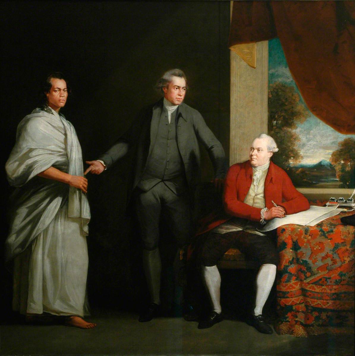
William Parry, Omai, Sir Joseph Banks and Dr Daniel Solander, c.1775, 
Captain Cook Memorial Museum, Whitby

Reynolds' portrait exploits the artist's established Grand Manner style to present Mai in non-Western dress, against a generalised 'exotic' landscape background in the very recognisable pose of the classical Apollo Belvedere. Despite the fact that Mai quickly adopted European clothes - a very short-sighted Samuel Johnson recalls not being able to distinguish him from other British visitors because his dress and manners were so Westernised - Reynolds' choses to emphasise his otherness but does so in a reassuring and non-specific way. The robes have been given a North African make-over, completed with the addition of a turban, to create what would have been for Reynolds' audience a more familiar version of Oriental garb. Only the subtly visible tattooing on Mai's hand and wrist gives an authenticity, easily missed in a eight foot canvas. Parry's portrait, which shows Mai with head bare, seems a more authentic representation, repeated by Nathaniel Dance, and indeed in Reynolds' own sketch.


Engraving after Nathaniel Dance, Omai, 1774, National Portrait Gallery

If Reynolds' interpretation is not an accurate reflection of Mai, the visitor who clearly embraced, and was embraced by, British culture, neither it is an accurate representation of the Polynesian who stepped off the Adventure. Instead he carefully repositions Mai as a 'noble savage', his exoticism contained within recognisable tropes of otherness. To a certain extent he was simply buying into the persona which Mai himself seems to have adopted by playing up his royal connections and social status. However, what the painting completely fails to convey is the ambivalence and complexity of Mai's reception in eighteenth century society. The British he met were intrigued and frequently admiring of him, yet they found him childlike and ignorant - his failure to master English was a source of humour. Equally there were bawdy rumours about his attractiveness to highborn women which suggests he was, in a limited sense, seen as sexually threatening.

Reynolds' painting is not the only one of Mai which we have. In 2002 Parry's portrait was saved for the nation after a join campaign by the Captain Cook Memorial Museum, the National Portrait Gallery and the National Museums of Wales. Parry is a much less well known artist, perhaps, but as a record of Mai's visit and reception his painting stands comparison to Reynolds' version. In addition there are a number of prints which record his appearance. Equally, there are better examples of Reynolds' interaction with non-European subjects. His portrait of Huang Ya Dong painted around the same date for the duke of Dorset, shows the young man seated cross-legged and wearing Chinese dress. Huang had travelled to Britain  with a member of the East India Company which was trading in Canton, and was much in demand for his knowledge of oriental botany. Reynolds also painted a much copied portrait, possibly of Francis Barber, the freed Black slave who was servant to Samuel Johnson; possibly of  Reynolds' own Black servant who acted as a model in other portraits. The strikingly characterful, unfinished image stands in marked contrast to the anonymous sidelined images of Black attendants which often appear in Reynolds' portraiture of the British upper classes.

The portrait of Mai is a wonderful example of Joshua Reynolds' work, but it is only one of many such examples of his Grand Manner paintings in British collections. The subject is unusual but it is not unique, either in terms of images of the Polynesian, or in terms of Reynolds' representation of global majority subjects. £25 million could buy a number of interesting works by, and of, under-represented groups, and British collections are full of unheralded works which have stories to tell. We don't need this painting and spending such a vast amount of money on it simply reinforces the Old Master canon just at a time when galleries are finally starting to think outside the restrictions of that particular box. 

Lucy Kemp-Welch: A natural horsewoman

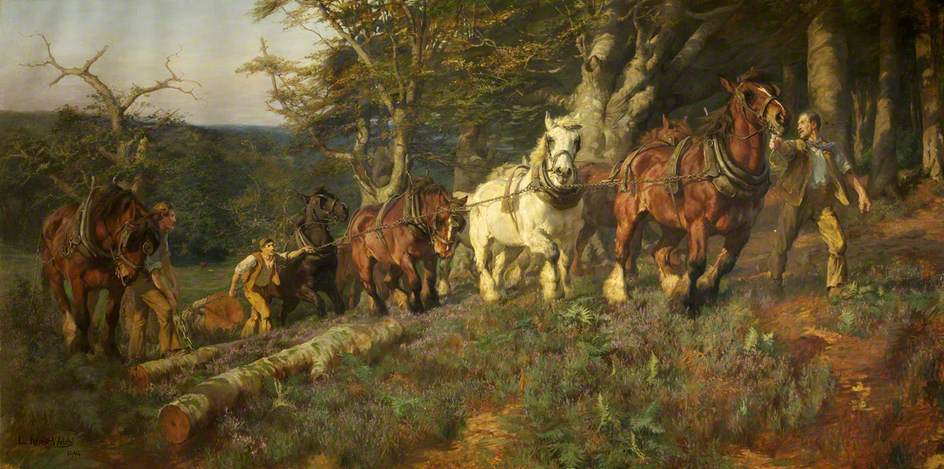
Lucy Kemp-Welch, Timber-Hauling in the New Forest, 1904, Bristol Art Gallery and Museum

I first came across Lucy Kemp-Welch (1869-1958) in Bristol, where her huge (over 3m across) canvas Timber-Hauling in the New Forest demands attention. Heavy horses strain uphill, dragging felled trunks through scrubby landscape, the hazy atmosphere and impressionistic handling suggesting both the vigour of the task and a certain elegiac nobility. Based on the scale and realism, an obvious comparison seemed Elizabeth Thompson, whose large military canvases had been wildly popular in the last decades of the nineteenth century. Rosa Bonheur, the mid century French Realist also produced monumental images of working animals, albeit more precisely rendered and often presented under dazzlingly-lit blues skies. And there were a host of popular Victorian painters of agricultural animals, regular Royal Academy exhibitors like Thomas Sidney Cooper (who worked on a smaller scale and in a more academic style) and Arnesby Brown’s sunny rural nostalgia. But for heroic power, movement and naturalism, Timber-Hauling was in a league of its own. 

Bournemouth-born Kemp Welch seems to have showed an early talent for animal drawing: she studied anatomy with a local vet, enrolled in the town's art school and exhibited her first work aged fourteen. In 1892, her mother, now widowed, moved to Bushey in Hertfordshire so that Lucy and her younger sister Edith could join Hubert von Herkomer's academy there. Herkomer, a colossus in the late Victorian art world, is a much less familiar name nowadays. Having started his career working for the illustrated press, he became an establishment portraitist, but continued to have an interest in 'condition of England' style realism. He dabbled in the French-influenced naturalism of New English Art Club painters like Alexander Stanhope Forbes, loosening his brushwork, but his colouration retained a mid-century sombreness. Herkomer’s heroic worker is clearly visible on the right in Kemp-Welch, the man’s pose even slightly echoing that of Hard Times

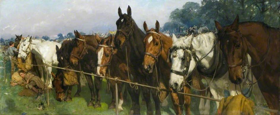
Kemp-Welch sent the first of sixty-one paintings, Gipsy Horse Drovers, to the Royal Academy in 1895. Just two years later Colt Hunting in the New Forest was critically acclaimed, purchased by the RA and given to the newly formed Tate collection. Kemp-Welch's signature style was established: large scale, working horses depicted in motion in a landscape setting with a loose naturalism. She did attempt to branch out. The late 1890s saw some unsuccessful history paintings (To Arms, Early Morning in the Camp of the Duke of York's Army before the Battle of the Roses at St Albans, 1898) and she experimented with imagined Boer War subjects. Later she would also produce The Riders (1910) based on a Robert Browning poem, a work which sits more comfortably with her illustrations for Black Beauty (1915) than with her large scale oils. She was primarily an observer who sketched from life obsessively and had a glass studio constructed to observe horses outside in all weathers. Arguably her greatest skill was to create characterful and individualised horses - rather like a less sentimental Landseer - so, for instance, Mixed Company at a Race Meeting (1904) becomes almost like an equine version of Thompson's Roll Call in which the everyday is elevated to status of hero.

Mixed Company at a race Meeting (1904) Bushey Museum and Art Gallery

In many ways, Kemp-Welch's life was as restrictive as her subject matter often appears. She never married and continued to live at Bushey with her sister until Edith died in 1941. She went abroad only twice and was content to make sketching tours within the UK each summer. Her career undoubtedly suffered because of her sex. Like Thompson, she failed in her attempt to become the first female Academician since the eighteenth century. However, she made the most of what was available to her. Wherever she travelled, she sketched and recorded what she saw, and many of the locations ended up in her finished oils. She was a founder member and first president of the short lived Society of Animal Painters, a clear attempt to elevate the status of her genre. She was one of the first women members of the Society of British Artists, and had a long and financially successful career.

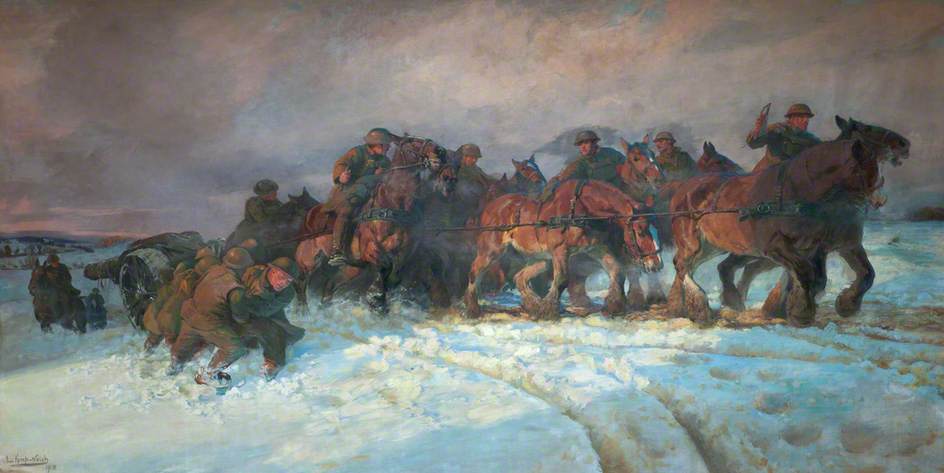
She suffered discrimination most cruelly during the First World War. Despite her popular and influential recruiting poster Forward! Forward to Victory Enlist Now (1914) as a woman she was not allowed to travel to France as a war artist. She had to content herself with observing manoeuvres on Salisbury Plain and at Russley Park Remount Depot (for retraining horses). Ironically, she produced two of her most iconic works Forward the Guns (1917) and  Straw Ride (1919) during this period but it must have rankled that Alfred Munnings, a younger, lesser-known horse painter was commissioned by the Canadian government to paint on the Western Front and effectively launched a career which took him all the way to President of the RA, from his war paintings. 

Big Guns to the Front, 1918, National Museum of Wales

Kemp-Welch took over Herkomer's school when he retired in 1906, but with limited success. The school declined from 1914 and closed completely in the 1920s. Its failure perhaps reflected a general decline in Kemp-Welch's reputation and production. The horse was part of the past, increasingly relegated to circuses (which she painted regularly throughout the inter-wars years) and elite leisure (which she had always been less interested in), and by the time she exhibited her last major work The Call in 1937, she had to fake the horse-drawn lifeboat shown because it had been discontinued. 

Perhaps Lucy Kemp-Welch was born a generation too late. Her work has much in common with that of the Newlyn School, doing for the working horse what they did for fishing communities. The Harvesters (1898) has the romanticised rural realism and rich palette of George Clausen's scenes of agricultural workers. She was one of those hard to categorise 'British Impressionists' who  applied a loosened technique and plein air observation, but preferred to work up their subjects indoors, on a larger scale. It was a style which became rapidly obsolete in the early years of the twentieth century, and by the time of her death Kemp-Welch was a forgotten and unappreciated figure. A revival of interest in British Impressionism in the early 1990s seemed to largely ignore her, perhaps, dare I say because she was a woman, certainly because she had little contact with the established art colonies and exhibited at the Academy. Neither Tate Britain nor the Imperial War Museum currently have their examples on display. Hopefully a 2023 book and exhibition (at Russell-Cotes Museum in Bournemouth) will kickstart interest in her work. 


Tuesday, May 9, 2023

'Hogarth's Britons': (Derby Museum and Art Gallery until June 4 2023)

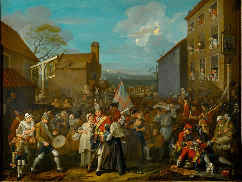
William Hogarth, The March of the Guards to Finchley, c.1759, Foundling Museum, London

The mouthful of a title, Hogarth's Britons: Succession, Patriotism and the Jacobite Rebellion, suggests an admirable level of ambition from the curators at Derby. I'm not sure they achieve their aims, but this is nevertheless a thoroughly enjoyable romp of a show. The exhibition never really decides whether it is a gallery survey of Hogarth's art or a museum exploration of the Jacobite rebellions. One the one hand we have cardboard cutouts of soldiers, a Jacobite garter and other memorabilia; one the other we have random examples of Hogarth's work, like his Election series prints and Marriage a la Mode loaned from the National Gallery.  The Jacobite Rebellions are certainly worth an exhibition. There is local interest, certainly, with Derby having the dubious honour of being the southern-most town the Scottish troops reached in 1745. More importantly, the period is generally not well covered, and, unless you are a fan of the time-travelling drama Outlander, much of the information presented here is probably new and definitely interesting. The question is whether the art on display really fits the narrative.   

William Hogarth is a slippery character at the best of times. Last year the Tate failed to make the case that he was at heart a European in a huge exhibition which, if you took away the captions, was really a retrospective of his whole career. In Derby, we are presented with exactly the opposite argument: Hogarth as the patriot. Well, yes and no. Hogarth was gleefully anti-French but his caricaturist's eye gleefully attacked a lot of things, including the English establishment. Derby's other great coup, a loan of The March of the Guards to Finchley (1750) from the Foundling Museum, shows the English army going to give battle to the Jacobites in 1745, but the troops are represented in a fairly disreputable light. Although the background shows them as a disciplined, martialled force, the foreground focus is on drunkenness, debauchery and disease: certainly George II found nothing to recommend it. In the end Hogarth sent it to the King of Prussia.

Allan Ramsay, Charles Edward Stuart, c.1745, National Galleries of Scotland

Paradoxically, whilst the curators are keen to present Hogarth as a patriot, they are more reluctant to see Allan Ramsay as a Jacobite sympathiser, despite his newly discovered portrait of Charles Edward Stuart and his famous image of Flora Macdonald. Ultimately perhaps neither artist was highly politicised: both sought royal patronage (of any kind) and were arguably more concerned with furthering their own careers than with pursuing nationalist agendas. In the same way, the exhibition is perhaps best viewed not through a historical lens, but as a collection of fine mid-eighteenth century art. Ramsay is a portraitist of understated skill and delicacy, who too often gets ignored in the Gainsborough-Reynolds duopoly. Hogarth is fresh no matter how many times you see his work and Marriage a la Mode is beautifully displayed here, at a perfect height and lighting to take in all the tiny subtleties.

Derby Museum and Art Gallery is worth a visit any time for their wonderful collection of Joseph Wrights and it has the warm, embracing feel of a place which is valued and has had money spent on it. There's a new entrance, built in the 1960s but recently refurbished, a lovely cafe and Objects of Hope, Love and Fear, a sympathetically but lightly curated display of world objects. Sadly, taking a wrong turn on the ways to the toilets, I discovered the old entrance, chilly, empty and neglected and a locked display of Victorian-labelled objects, which had clearly suffered water damage. Some use surely could be found for these areas.


Zurbaran (National Gallery until August 23 2026): Perfection in a Piece of Cloth

Francisco de Zurbaran, The Martydom of St Serapion , 1628, Wadsworth Atheneum, Hartford Connecticut Francisco de Zurbaran is often describe...