Thursday, April 3, 2025

'Dora Carrington: Beyond Bloomsbury' (Pallant House Gallery, Chichester until April 27 2025)

Dora Carrington, Spanish Landscape with Mountains, c/1924, Tate, London

Describing Dora Carrington as 'Beyond Bloomsbury' is a double edged sword. Undoubtedly it is sound marketing to attach a familiar name to a relatively unknown artist, but the cosy Charleston clique are a very marmite bunch. Even the clever suggestion that Carrington is 'more than' Bell, Grant and co might well be enough to put some people off. More importantly, the association is tenuous, focusing more on biography than art, and it highlights the big problem in dealing with Carrington - her complicated, tragic life gets in the way. The best thing to do - and the best thing the curators at Pallant House could have done - is to ignore the personalities and concentrate on the paintings. Unfortunately, they try but don't succeed.

Another barrier to understanding Carrington: her art was varied and variable. Dotted throughout the exhibition are loosely painted, washed-out works which could indeed fit into that Bloomsbury aesthetic. The watercolour of Spanish Soldiers at a Stream with its flattened background pattern of verticals and arcs and elongated figures reduced to khaki-ed anonymity is an extreme example of this. Her characterful portrait of the cedar tree at Tidmarsh, although it bridges the gap to her more recognisable strong-coloured chunkiness, has the same scrappy linearity. Then we get Carrington the craftsman, obsessively decorating her homes and the objects in them, and making a bit of money on the side with 'tinseled pictures' using textured tin foil on glass. The evidence here is sketchy - old photographs and a few surviving pieces. The style seems almost fin-de-siècle fairy-tale in its sugary colours and curving, dapple-brushed figures. Her often reproduced Iris Tree on a Horse is one of the few occasions in which she transferred this decorative style into an oil painting.

So far so Bloomsbury, perhaps, but if you want to get to the heart of Carrington's art you need to start at the beginning, with the Slade. It is represented here by skillfully rendered nudes, for which she won prizes (an exhibition of UCL's collection of Slade student work is one I would really like to see). Carrington was one of a prodigious group of students: a photo from around 1912 shows her alongside Stanley Spencer, Mark Gertler, Christopher Nevinson; other contemporaries included David Bomberg and Paul Nash. Leaving aside the fraught, possibly abusive relationship Carrington had with Gertler, these are the artists who most closely share her aesthetic vision. Most of them, at some point, exploited a pseudo-naive style which, rather in the way New Objectivity did in Germany, could show the world in all its oddness by appearing to simply show reality. Carrington's two great landscapes in show here, The Farm at Watendlath and Spanish Landscape with Mountains, exemplify this. Watendlath has a brooding creepiness, as otherworldly as a Tolkien illustration it foregoes tweeness in favour of proto-Surrealist unease. Meanwhile, the Spanish countryside is evoked in bodily forms reminiscent of Ithell Colquhoun.

Dora Carrington, Mrs Box, 1919, The Higgins, Bedford

It is, however, in portraiture that Carrington really shines. From the Van Gogh-like salt of the earth solidity of Mrs Box to the crumpled pastiness of EM Forster, she approaches her sitters with utter conviction and confidence. She treats pots of flowers with the same solemnity. Tellingly, when she paints herself, she resorts to style over substance, retreating behind cap, pantaloons and strong outlined colour-blocks which remind one of Mary Cassatt's prints. She twists, already in the process of departing, as if wary of giving up too much of herself. The filmed cavorting, the long-fringed 'crop-head', the lack of signed works and reluctance to exhibit: this was a woman who didn't want to be exposed. It is this self-portrait, above all, which makes me reluctant to jump on the biographical band waggon. Her life is there in her painting - Lytton Strachey, Gerald Brenan, Mark Gertler, Ralph Partridge, Tidmarsh. Would she really have wanted us to flesh it out any more, to analyse and agonise, to empathise and pity? 

Pallant House do a great job of promoting British twentieth century art and they have a solid track record in promoting lesser known, especially women, artists. Dora Carrington deserves the recognition and this show succeeds best when it lets her art speak for her. It is ultimately frustrating that the curators can't quite resist bringing in the two 'B's. Ignore biography, in my view Dora Carrington is far, far beyond Bloomsbury.

Saturday, March 8, 2025

'Leighton and Landscape: Impressions from Nature' (Leighton House, London until April 27 2025): Everyday Escape

Frederic Leighton, The Bay of Cadiz - Moonlight, 1866, Leighton House Museum, London

Frederic, Lord for a day, Leighton is easily pilloried as the epitome of Victorian academic art. His mighty, frozen in aspic, Cimabue's Celebrated Madonna usually greets visitors to the National Gallery. Flaming June is the height of chocolate box popularity. If you know his home, now Leighton House museum, you might sense another side, but that too can slot neatly into cliches about nineteenth century orientalism. However, the museum's current exhibition, Leighton and Landscape, tosses all that out the window. Leighton was a traveller, yes, to Italy, Spain, North Africa, but he was not a tourist. His paintings are small, quiet, celebrations of the ordinary. A surprisingly large, thoroughly researched and beautifully presented show ends up making the ordinary seem magical and turning Leighton from eminent Victorian into sympathetic interesting individual.


Leighton travelled throughout his life, compulsively, almost as therapy. It was a way of escaping his responsibilities, his public. As much a way of being alone as the ascetic bedroom you can visit at his home. It was, you feel, a way of getting back to his artistic roots, to the basic principles of observing and recording. The exhibition, consequently, is a means of discovering the man: you see what mattered to him through his eyes but you also sense the restlessness of someone who was receptive to new experiences, experimental in his approach, happy to leave his comfort zone. This was a man who could sketch alongside the rebel Newlyn artists in Cornwall, who was prepared to make a five hundred mile round trip to see Biskra on the edge of the Sahara. He could challenge himself to record every leaf of a lemon tree with precise, painstaking beauty, yet dash off, with almost impressionistic bravado, the swirling peatiness of Findhorn river. This was a man who turned his back on the Dome of the Rock because the opposite view was more interesting. 
Frederic Leighton, Sketch: Rocks and Water, Scotland (A Pool Findhorn), c.1890, Leighton House Museum, London

A much bigger exhibition than you might imagine, with over sixty works, spread across different exhibition spaces (one of my few criticisms, but they have to work with the architecture they have), there are surprises at every turn. It is impressively researched. Not only are there significant number of paintings from private collections, which must have involved a lot of leg-work, but there is an effort made to identify locations and provide near-contemporary photographs of them. Again, not an easy task. They point out the very odd occasion when Leighton referenced these landscapes in his history paintings. Finally, it is elegantly presented, especially in the main Verey Gallery. You are led of a winding journey of your own through free-standing panels, which stop the small paintings being overwhelmed, and allow you to get indecently close. 

The moonlit view of Cadiz which has become something of a poster-boy for the exhibition is in reality something of an outlier. Leighton rarely included figures or indeed a focal centre, and arguably his best works exploit strong sunlight with the same crisp effectiveness of Corot. Rocks, both formations and patina, and silhouettes; man-made geometry juxtaposed with vegetation, colour variations, especially in the elongated strata of his Nile paintings - these are the things which he takes notice of. Despite his draughtsmanship skills, which he practised rigorously throughout his career, his spare pencil drawings are the least engaging works in the show. Leighton is an oil painter through and through, you sense someone who has complete confidence in the medium, and that confidence is conveyed through the easy effortlessness of the works. Leighton was notorious for never cutting corners in the laborious ritual of his academic works, but here he puts himself completely in the moment - precision, fluidity, depth, detail are determined by what he sees rather than what he has learned.  Perhaps it helped that I went on a quiet day, when I largely had the place to myself, but the peaceful intimacy of these landscapes was profoundly therapeutic. I will never look at Leighton the same way again.

Thursday, January 30, 2025

'Glenn Ligon: All Over the Place' (Fitzwilliam Museum, until March 2 2025): Here and There Not Everywhere

Unknown artist (Dutch), Adoration of the Kings, c.1520, Fitzwilliam Museum, Cambridge

The Fitzwilliam Museum in Cambridge has been going through a process of self-reflection, reassessing its history and collections. Last year they won awards for their exhibition Black Atlantic: Power, People, Resistance; this spring will see a second show, Rise Up: Resistance, Revolution, Abolition. Inviting Glenn Ligon to reinterpret, redisplay and critique the museum's permanent collection is another part of this process. Artist interventions are an increasing feature as institutions seek ways of engaging both with the past and with diverse contemporary audiences. The British Museum recently invited Hew Locke to do the same. However, while the Fitzwilliam's intentions are admirable, the impact initially seems strangely muted.

You know something isn't right when you walk past the first installation without noticing it. Waiting for the Barbarians is a set of neon scripts on the Fitzwilliam's imposing classical portico. The museum have used their grandiose entrance to good effect in previous exhibitions: noticeably plastering their columns in banknotes for Defaced. Here though, Ligon's potent message is small, dwarfed by the supporting scaffolding, barely illuminated. The effect is a visual whisper, arguably a little apologetic, and ultimately disappointing. Armed with a plan you can then make your way round the museum on a kind of Ligon trail. It is patchy: 'all over the place' seems an exaggeration. 

Some pieces work better than others: black moon jars cluster amongst the porcelain displays with a sense of mild threat. You can't walk past these: in fact you have to resist touching their sleek bulbousness. Apparently similar, they are in fact individual; apparently monochrome, they are in fact infinitely subtle shades of blackness, apparently perfect they are a mass of surface blemishes. The matt vacuum sucks you in compellingly. Yet, their looming power distracts from the careful curations around them which reference cross-cultural appropriation and interaction. There is a running tension throughout Ligon's work between visual forthrightness and intellectual nuance.

Upstairs, amongst the fine art rooms the impact is also mixed. Ligon's academic hang of flower paintings is a joyous, riotous triumph. The Fitzwilliam always devotes this room to their impressive collection of floral art but it is usually hung with a sparse restraint that showcases the furniture and polished floorboards as much as the art. Here, flowers tumble off the walls so that you hardly see where one picture ends and another begins. This opulence, as the now customary line about still life goes, is supposed to underline imperial plunder, the capitalist drive for possession and control. But it is nature and art which triumph here. Repeated patterns, colours and forms constantly engage and distract, rippling across the surface, pushing out all thought of politics. Anyone who things flower paintings are tame and tedious, needs to sit here and soak this up. Sumptuous, sensual, subtle. If I was the Fitzwilliam, I would keep this display permanently. It is magnificent.

Elsewhere, Ligon tackles the familiar story of the Balthazar, the Black Magi. Isolating a single c.1520 panel on the wall, he makes us look closely, but ultimately it is not painting which holds the attention, it is the wall itself. Old paper reveals ghosts of pictures past in its eerie pattern of shading: gleaming gold finally seeing the light of day as the canonical paintings were stripped out. The only other image is one of Ligon's own -  Study for Negro Sunshine (Red) - the first of a series which goes on an irreverent journey through the galleries, disrupting the natural order of symmetry and rhythm. A constant reminder of another presence, which is somehow never quite present enough.

The Fitzwilliam's intense little octagon gallery becomes the focal point of Ligon's interventions, dedicated to his own large scale, text-based works. After the gentleness, the quiet, these are raw screams of rasping texture, the words overlaid so frequently and violently that eventually they become blotted out entirely in a visual white noise. Stand in the centre of the room and it is a surround-sound assault, but up close to the surface of an individual canvas the complexity of material and message draw you in with the same mesmeric power of the matt moon jars. The museum's trail makes this the end point, but it pays to retrace your steps because Ligon's own works make his interventions all the more meaningful. This is a man for whom words are as important as images, whose inspirations are writers more often than artists. Do not underestimate him. Sometimes you don't need to be all over the place, you just need to be clever. 

Friday, January 3, 2025

'Drawing in the Italian Renaissance' (King's Picture Gallery until March 9 2025): Sometimes Less is More

Fra Angelico, Bust of a Cleric, c.1447-50, Royal Collection Trust

The King owns a lot of Renaissance drawings. The hundred and sixty currently on show at his own Picture Gallery so barely scratch the surface that the Royal Collection Trust have still managed concurrent  loans to the Royal Academy and the National Gallery amongst others. This embarrassment of riches must make life difficult for curators spoilt for choice, but in the case of  Drawing in the Italian Renaissance it also seems to have led to a certain complacency. There is a 'let's just put it out there' excess which makes it difficult for anyone but the most dedicated enthusiast to keep their focus and interest alive. A smaller, tighter show might ultimately have been more effective.

The exhibition eschews chronology for a thematic approach. You can be too slavish about dates but equally, drawing develops so dramatically over the hundred or so years covered here, that it makes sense to clarify how and why that happens. The other contextual omission is geographic - Italy at this point is not a unified whole and regional stylistic variations are not only key to getting a grip on any art of the period, but intrinsically interesting in themselves. Equally, there are beautiful vitrine displays of materials and a good summary of the link between drawing and increased paper production, but these seemed strangely detached from the images of the walls. I would have loved a comparative line of red chalk drawings, or of different coloured papers. Instead, the themes which are chosen are broad and diffuse - the emphasis always on the range of the collection rather than an analysis of it. Exhausting and frustrating rather than illuminating. 

Lelio Orsi, A Crossbowman, c.1575, Royal Collection Trust

But, but, but, the drawings themselves (mostly) are incredible. And the sheer number and range on show dispel many of the myths of the Renaissance. Yes, there is Leonardo's anatomical precision but you also get a wonderfully loose landscape sketch and a page of his playful cats. Male nudes too beautiful to have been drawn from life hang alongside grotesque heads. Figures and poses generated with an immediacy which seems to belong in the nineteenth not the sixteenth century. There is humour - Lelio Orsi's design for a crossbowman in action destined for the front of a house - and absurdity in the form of an ostrich which may or may not be by Titian and a surreal lobster landscape by Annibale Carracci. There is excess: Giovanni Stradavus throws everything into his Alchemist's Laboratory and understatement. Whether Fra Angelico produced the ethereal metalpoint and white highlighted head or not, it is a thing of divine perfection. Of course there are lesser works, lesser artists, but what comes across here is the centrality of drawing, the imperative of it to plan, record, practise, and impress. And equally, the incredible survival of works which were rarely intended for preservation, rarely valued in their own right but somehow have made it down the centuries to be incongruously paraded on the King's walls today.

Drawing in the Italian Renaissance has been widely applauded, possibly overrated. It is one of those exhibitions in which curatorial missteps are magnified at the time, only to fade as memories of the art take over. It could have been smaller. It could have been better structured. Wall texts which include low-hung, postcard sized reproductions of relevant paintings are tokenist and annoying. Encouraging visitors to draw seems like an engaging idea but when you want to get up close to a small artwork, people busily sketching on stools simply get in the way. And the cavernous, bombastically decorated rooms of the King's Picture Gallery are an unsympathetic environment for pale, small, quiet works. Despite all that, it is a privilege and a joy to see the images themselves. On a blue background a young man focuses on the paper on his knee, whilst a dog sleeps in peaceful curl. You can hear the silence, imagine the motes of dust in the raking light, feel the concentration. We know nothing of the artist, of the sitter, of the occasion. Simple, fragile, momentary and yet arrestingly powerful. Less but so much more.


Tuesday, December 31, 2024

'Discover Constable and the Hay Wain' (National Gallery until February 2 2025): Confected Landscape

John Constable, The Hay Wain, 1821, National Gallery, London

The Hay Wain is much derided. Over familiar, over merchandised, it is one of those paintings which people have long stopped looking at, yet which has never quite achieved untouchable 'national treasure' status, like, say, The Fighting Temeraire. Recently it has gained new exposure in parody and satire - Peter Kennard's anti-nuclear version - but it has also become embattled as part of the 'contested landscape' debate. It is either brave, or perverse, of the National Gallery to devote one of their brilliant 'Discover' exhibitions to it. Hats off because it is a gem of a show, which should make everyone look and think again about not only this painting, but John Constable's work in general. Next year we will be approaching the 250th anniversary of his birth, to be celebrated with a heavyweight Tate Britain showdown between Constable himself and JMW Turner. This is a good way to kick things off.

The Hay Wain's big problem is that everything about it seems conservative and old-fashioned to twenty-first century eyes. It is not just the rural setting, the horse and cart, the picturesque cottage; it is the manner of execution which seems, to us, so 'finished'. In fact, Constable's real difficulty is that he falls between two stools. His work, as a telling contemporary quote on the wall at the start of the show explains, was actually considered too loose, too sketchy and too difficult to look at. The curators give us a fine wall of nineteenth century landscapes, including examples by John Linnell and Francis Danby, which prove the same point. And up close, in person, the dashes of white, the imprecision, the textured dottiness of Constable's work become impossible to ignore. Subconsciously, they are always there, affecting the way we view it.  The cosy artificiality of earlier landscapes - staged groups of figures, light and shade balanced compositions, faded distance - register as paintings and judged accordingly. Constable is assessed against nature and naturalism. Our brains link his visible hand forward to Impressionism and find him wanting, but judged against what was known and seen in the 1820s his radical technique is blatantly obvious.

The show also contextualises the Hay Wain within Constable's own work - other examples of his big, finished set pieces - The Cornfield, Salisbury Cathedral from the Bishop's Grounds - and preparatory sketches. There are the inevitable cloud studies, despite the fact that his interest in the sky really post-dates the Hay Wain. More interestingly, we can follow the development of the painting itself from early representations of Willy Lott's cottage through to the full scale sketch which acted as a plan - but not an identical one - for the finished work. This is landscape which is carefully orchestrated, certainly confected if not contested, in an attempt to produce something which was both personally and artistically meaningful, and yet fell within the bounds of academic acceptability. Again, the exhibition provides ample contemporary evidence that Constable was pushing the boundaries - along with the galling truth that it was the French who first saw the aesthetic value of this most English of landscapes. 

There are those who will think the National Gallery have skirted round the issue of Constable's idealisations and omissions. The show contains contemporary cartoons and one of Stubb's harvesting scenes where the sturdy labourers are presented as fine specimens in a way reminiscent of his images of race horses, but the curators avoid jumping on the 'art as social history' bandwagon. There are no starving peasants, no rampant enclosure, no radical unrest, in Constable's work but should we really expect there to be? He is both painting his own, necessarily limited, experience as a member of a land-owning family, and constructing finished canvases from memory, generating an inbuilt nostalgia which was never going to be realist reportage. Historians have been deconstructing Constable's representations of rural life ever since John Barrell's brilliant 1980 Dark Side of Landscape  - there's plenty there if you want to look for it, but please don't throw him under a bus for not being Courbet.

The National Gallery's 'Discover' exhibitions rarely disappoint, but the Hay Wain show is particularly impressive. Giving the most banally familiar of paintings space and context, quite literally makes you see it with fresh eyes. Constable is always the dull, worthy counterpoint to the Turner's bravura excitement. But underestimate him at your peril. His paint fizzes with life, dense and dazzling in equal measures. You feel the glow of the sunlight and become immersed in the barely there details. Soak it up. Enjoy.

Thursday, December 19, 2024

'Van Gogh: Poets and Lovers' (National Gallery Until January 19 2025): Art in the Raw

Vincent Van Gogh, The Sower, 1888, Van Gogh Museum, Amsterdam

This Van Gogh exhibition had to do some pretty heavy lifting. My initial reaction had been cynical - a good money spinner to help pay for the Sainsbury Wing renovation. The National Gallery might never have held an exhibition dedicated to arguably the world's most famous artist, but everywhere else has. What more is there to be said? Having queued outside in the rain and faced with a wall of bodies and the ubiquitous camera phone junkies between me and every painting, I was pretty determined to not like this. And yet, one look across a crowded room....

Van Gogh is always better in the flesh. His work sings, his colours glow, his brushwork comes alive so that the canvases dance off the walls and into your heart. This is the great irony - an artist known for his traumatic life and death story is actually the producer of some of the most joyous, life-enhancing paintings in the history of art. And the National Gallery curators have pulled off the remarkable feat of reminding you of that. By ignoring the biography and almost forcing their visitors to just look, they have given Van Gogh new life. I took their aims to heart, ignoring the accompanying booklet which does flesh out the backstory and just soaking up the paintings and drawings on the walls. Sixty one works, which seemed to end far too quickly, which banished dreary December and pre-Christmas anxiety and belied all the cliches about self-mutilation and mental instability, about impossible friendships and unsold artworks. 

The curator's premise, laid out in the opening display, of Lieutenant Milliet (The Lover), Eugene Bloch (The Poet) and The Poet's Garden, is a stretch, but a clever, convincing one. More importantly, it sets the mood, because for all that he painted the world and the people around him, Van Gogh was a dreamer, a romantic, whose representation of life was filtered through his emotional response. He has been straight-jacketed into the Impressionist/Post-Impressionist narrative but he was constrained by Paris, and rubbed up fractiously against Gauguin - there seems a far greater affinity in his work with those early twentieth century Expressionists who found love, life and community in villages like Murnau. That opening room creates a mood which successfully permeates the whole show: scrubby town parks become exotic and paradisiacal, everyday figures become iconic folk heroes.

It is not that Van Gogh is perfect. You see his weaknesses on repeat: he struggled to work out what to do with the foreground often creating canvases of two awkward halves; he was obsessed with unnecessary figures, men with splayed legs and women with angled parasols; his Japonism was often heavy-handed. He was not afraid to acknowledge his influences, rather he foregrounded them. This exhibition might only cover the period 1888-90 - the development from Dutch grunginess through anxious Impressionism is not included - but you see his homage to Jean Francois Millet, the majestic Sower, haloed by the sun who strides across a landscape sliced in two by that angled, Gauguinesque tree; you see him deliberately reference Emile Zola, Charles Dickens, Harriet Beecher Stowe; you see him working through the choice of flattened, blocked colour or hatched impasto. You see too, through much less familiar drawings, how much of a craftsman he was, walking miles to sketch, returning to the same images, experimenting with new materials. It is hard not to look at Van Gogh's drawings and feel the lack of colour but Weeping Tree, with the characteristic reed pen softened by black chalk, is boldly other-worldly, a mixture of Art Nouveau patterning and Mondrian's early experimentation. It doesn't weep so much as centre the whole landscape, the trunk like a spinal cortex connecting the canopy with the grasses.

Vincent Van Gogh, Weeping Tree, 1889, Art Institute of Chicago

The last room feels slightly anticlimactic  - perhaps inevitable after the starriness of all those celebrities - the chair, the bedroom, the sunflowers, the man himself. Both the last theme (variations) and the examples feel forced - what can we do now - and there is the inevitable sense that the end isn't the end, not quite. There are exceptions: Tree Trunks in the Grass with its two strong columns of bark reduced to patchwork patterns against a fluff of greenery and almost three dimensional white flowers. As with so many of the canvases, there is no horizon, the world reduced to this tiny corner, teeming with life. Sometimes you don't need the big picture; sometimes it doesn't help to know the context, biography, the future. Van Gogh brings you into the moment with such a raw connection that you can feel the hand holding the brush at your shoulder. No other artist manages to collapse time so effectively. There is only the here and now.

Friday, December 13, 2024

'Michelangelo, Leonardo, Raphael: Florence c.1504' (Royal Academy until February 16 2025)

Michelangelo Buonarroti, Male Nude seen from Behind, c. 1504-6, Casa Buonarroti, Florence

I'm sure the Royal Academy didn't intend their 1504 exhibition to coincide with the new BBC drama doc in which Charles Dance gently hams up his prosthetic broken nose as the old Michelangelo looking back on a great rivalry with Leonardo and Raphael. Having resorted to shouting at the TV screen in frustration at its inaccuracies and missed opportunities, I was looking forward to some serious curation. But RA shows are often frustrating half-successes. Three rooms, one of which is entirely devoted to a reverential display of the Burlington House Cartoon, was never really going to be enough. Like the languid historical recreations and repetitive talking heads of the screen version, this show constantly threatened to teeter over into a triumph of style over substance.

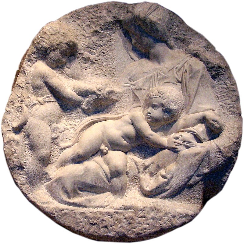
It all started promisingly with the Taddei Tondo, crisply lit and well explained. The image of the Pitti roundel alongside (and they were never going to get the original), Piero di Cosimo's iteration of a tondo and Raphael's Bridgewater Madonna - it all felt satisfying focused. But at the same time, there seemed to be so much more to investigate. The National Gallery's Raphael show of a couple of years ago, for instance, had a great exploration of how he developed his compositions to suit a roundel form. Exactly what Michelangelo was doing between is two relief attempts, yet ignored here. Equally, the similarity in pose between the Michelangelo's Christ and Leonardo's cartoon version, was pointed up, but it required strained vision across a crowded gallery to really appreciate it. 

What you could not fault was the judicious choice of drawings which balanced a focus on process with a desire to just bask in the sheer beauty which these artists could conjure up on paper. A few examples here (some from the royal collection) had more impact than roomfuls at the Kings Picture Gallery. Michelangelo's stretching male nude from the Casa Buonarroti seems to encapsulate his whole artistic practise with its tense striving. Raphael's back view of David was similarly revelatory, yet seemed marooned on a wall: the curators had thought to include an image of Michelangelo's sculpture, despite its ubiquitous fame, but it was not displayed alongside the drawing.

Similarly, the Leonardo cartoon, was an underused resource. It is familiar to most London gallery-goers and so surely needs to justify its inclusion, despite the RA's new research which has suggested, for the first time, the purpose of the drawing. From memory, I believe the National Gallery hung it lower: certainly here it felt slightly diminished here, a little high and difficult to view without reflected light. It seemed significant that despite a bench in front of it, and a fairly busy exhibition, no one was really lingering as perhaps the curators intended. In a show whose dark walls and necessarily subdued lighting generates a sense of hushed awe, this feels too much as if we are expected to worship at the altar of Leonardo's genius.

The last room was devoted to the 'battle of the Battles', a bizarre non-event which has always captured more attention that it probably deserves. You can only ever get so far with 'what ifs' and one whole wall devoted to an outline silhouette of Michelangelo's Battle of Cascina seemed particularly indulgent. That said, the exhibition actually did a very good job of conjuring up both the essence and the imagined reality of the two compositions: Leonardo's swirling, character-driven emotion which seemed strangely old-fashioned with its contorted horses and precisely rendered armour, and Michelangelo's nude-fest that increasingly seemed like a dry run for the Last Judgment. Again, the drawings were the stars, so why they were not on the wall is a mystery.

Michelangelo Buonarroti, Taddei Tondo, c.1504-5, Royal Academy, London

Can you really go wrong with an exhibition entitled Michelangelo, Leonardo, Raphael: Florence c.1504? It will get people through the doors with the names of probably the greatest triumvirate in the whole of art history. It brings with it a compelling in-built narrative of competition and rivalry. But it is also perhaps too easy to be complacent: you already have the only Michelangelo sculpture in the country, you know the National Gallery might be quite glad to get the Burlington Cartoon off its hands during the Sainsbury Wing revamp.  Personally, I think the Royal Academy can do better. A three room exhibition needs to be tightly curated, with every choice justified and made to work. Ultimately, 1504 gets by on the beauty of the Renaissance drawings it displays. Is that enough?

Tschabalala Self's 'Lady in Blue': Beryl Cook for the Twenty-first Century

Tschabalala Self,   Lady in Blue, Trafalgar Square, London Trafalgar Square's Fourth Plinth sculptures are supposed to excite comment. T...